Every day we come across multiple instances when we interact with a website, an online application, display ads or other digital assets. We usually navigate from one page to another on these applications via different buttons.
What exactly are CTAs?
We’ve all fallen prey to attractive discounts or other offers online and bought merchandise. Other times we encountered prompts that ask us to subscribe or sign up for an email news-letter.
These buttons that prompt an action from users are called call to action or CTA buttons. The call to action button plays an important role in all such conversions.
Call to action (or CTA) originated as a marketing term that refers to an action that a marker wants its audience to take along the user journey.
In the context of the websites and apps you encounter daily online, the call-to-action (CTA) is a button that prompts the user to act. It can either correspond to direct sales or for navigating the audience to the next step in the journey. CTAs guide users towards goal conversions.
What makes a good call-to-action button?
Now we must always remember that call-to-action can also be a simple text prompt, an image or a button. Though stats have proved that CTA buttons have always performed better for conversions. Which makes designing a good call-to-action button a necessity for any website or app to succeed.
A lot goes into the making of a perfect CTA button that brings high conversions. Let us start from the basics, a CTA button consists of a few essential elements. These are listed as follows.
- Shape & size
- Color
- Copy
- Placement
What separates a good CTA from a bad one is just the optimum combination of these elements. Let us discuss them briefly.
#1 – Shape and size
Now a designer has complete freedom to design the CTA button the way he/she wants to. However, the industry standard and the ones that have seen maximum conversions are the ones that are rectangular and rounded rectangle in shape.
When it comes to selecting a size, make sure that the button is big enough to grab your audience’s attention and offers enough space for the intended copy to be readable.
We will go over the optimum design practices in the upcoming section.
#2 – Color
This may seem to be a small but in fact is a really big deal for increasing conversions. And this is a secret that only a few seasoned designers know.
Color selection plays an important role because humans react differently to different colors. And the same applies to button design as well.
We will discuss the theory and some top strategies on best color selection in upcoming sections of this article.
#3 – Copy
Copies are the meat of the button. It is the prompt that is displayed on the button. It conveys the action that you want your audience to take next.
While the copy depends on the type of action you require, there are some general guidelines that one should follow for a high conversion ratio. We will discuss these in depth in the coming sections of this article.
#4 – Placement
There are many sources online that give different guidelines on the placement of CTA buttons. Some preach above the fold and others below the fold, while both are correct in their own sense but the best approach is to follow the design.
The placement of a CTA button is discussed in greater lengths in the upcoming sections.
The optimum design practices for CTA buttons
Here are some of the top design practices that you must implement for a successful CTA button that brings in the conversions.
- Have a consistent design
- Reserve primary colors for the CTA
- Have a clean design
- The CTA must stand out to grab attention
- A/B test to determine the best design
Let us discuss each strategy in detail.
#1 – Consistent design
Having a consistent design is of utmost importance for any website or mobile app design. This is applicable for the size, shape and color of the CTA buttons.
While different CTAs may target different objectives, therefore they can have different copies or action prompts. But keep their shape and size consistent.
The buttons should also compliment the overall design of the page.
Any inconsistency not only shows that your website or app is not professionally designed, which in turn may hamper your brand image.
Not only that, but inconsistencies are very distracting for any viewer and this may result in high churn.
PRO TIP: In case you have two CTA buttons aligned together and one of them holds higher priority than another. Then you can assign the primary color to the button that and a secondary shade to the less important.
Otherwise, you can give both buttons the same design if they have equal priority.
#2 – Primary colors for CTA
The best of the designs are the ones that reserve the primary colors for the CTA buttons. Ensure that you select bright and attention-grabbing colors and designate the primary color to the button.
Most successful designs have the colorful buttons on either white or black clean backgrounds. This immediately helps draw your audiences’ attention to the button.
The button on the left blends with the background color and does not stand out or attract users, that leads to very low conversions. It is very difficult to locate the button in the first place.
However, on the right-hand side, the button is clearly visible and easy to locate that leads to higher conversions.
Which button would you select from these?
#3 – Clean design
The best of the designs are clean and to the point. Do not clutter a lot of design elements in single space as it distributes your viewer’s attention and does not convert well.
Having a clean design helps your audience cut through the noise and results in many more clicks than ever before.
We will see some examples of brilliant call-to-action buttons in the upcoming section.
#4 – Stand out
This should be a given, if you want conversions, you must highlight your CTA buttons in the best possible way (without going overboard of course).
And essentially, all the above ideas we discussed boils down to this single strategy, to have your CTA’s stand out in the design.
Pick the color, shape and design of the button that not only compliments your overall page design but also shines in it. Make sure that the button does not blend in with the design.
#5 – A/B test
We know that achieving perfection is impossible, especially with something as subjective as design. Even while designing you might have spent a good amount of time deciding the better design from the ones you’ve created.
No true designer ever creates just one design for the same project. They always have multiple options to choose from.
This is exactly where A/B testing comes into play. Run a simple A/B test and let your audience decide the better option for your brand.
Conducting an A/B test is an optional step; however, it is highly recommended.
Top tips on color selection CTA buttons
As we discussed earlier, color selection is an important part of any CTA design.
Different colors bring out different emotions. For instance, colors like orange and red emote optimism and excitement, the color blue emotes trust and the green emotes growth and peace.
Which is why you must select a color that compliments your objectives with the call-to-action button. In a test performed by Hubspot, the red button outperformed the green button by 21% in terms of conversions.
Finally, make sure that all the buttons are consistent and compliment the design. We discuss this further in the next section.
How to write persuasive copies for CTA buttons?
TL;DR: The copy should be short, crisp, attention grabbing and action oriented. They should be able to compel anyone reading it to click through.
You’ve designed the buttons optimally and have figured everything about the button, however, having a compelling copy is as important, if not more important, as the other factors.
Many times, we spend hours of testing with the buttons, colors, fonts and other factors but rarely do we focus that much on the button content.
Creating a compelling copy for the CTA button is a complex process, however, we will try to break down the process for you.
Since the space is limited, therefore, the copy should not only be short but also to the point and exactly convey the action required.
However, there are a few keywords that have been identified to be most persuasive in nature. They are as follows.
- Free
- New
- Guarantee
- Start
- Easy
- You
- Now
This list of keywords has been curated by experts after years of experience. These keywords work well since they instantly prompt an emotional reaction.
You can then combine the above keywords with an action-oriented verb to create the perfect copy. These are.
- Start
- Stop
- Build
- Join
- Learn
- Discover
- Register/Sign up
- Login/Sign in
Some examples for compelling CTA copies are as follows.
- Sign up FREE
- Get started
- Continue with Facebook
- Find out more
- Buy now
- Check out
- Learn more
- Save up to 50%
… and more.
Another very effective strategy is to create CTA copies that create a sense of urgency and drives visitors to take immediate action.
- Only X days left
- Limited supply
- Closing soon
- While supplies last
- Today only
- Last chance
- Only till offer lasts
- Offer ends on “date”
- Hurry
- Immediately
- Subscribe NOW!
PRO TIP: You can experiment with uppercase and lowercase alphabets for your button copy. Both have different effects and can highlight specific terms or the whole copy.
How to place the CTA button optimally
The placement of the CTA button should be dictated by the complexity of the page design and not by a single rule.
A page that is short and has very less content, consider placing the button above the fold and for a page that has complex information and greater amounts of content, consider placing the button below the fold.
In fact, “the fold” methodology for CTA buttons is a myth and a test conducted by Marketing Experiments proved that longer landing pages generate 220% more leads than the simple above the fold call-to-action button.
While the above is true for a website but it becomes even more complex for a mobile application. Especially the shopping apps like WooCommerce mobile apps that are mostly filled with product and category buttons. The same also goes for Shopify mobile apps and other such eCommerce apps.
Here the button placement should follow a natural downward zig-zag pattern that starts from the top left to the bottom right. This follows the natural scanning pattern and is termed as the Gutenberg Principle, this was coined by Edmung Arnold, the renowned newspaper designer.
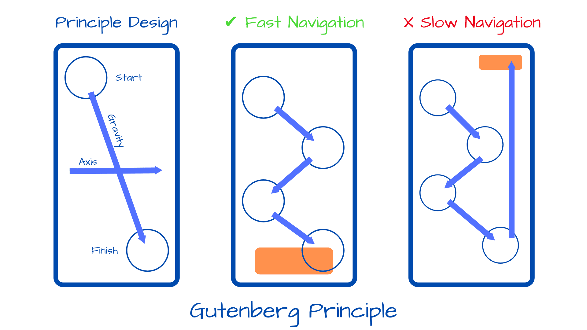
Generally, a mobile design with the button at the bottom performs better than the design where the button is on the top
Some examples of brilliant high converting CTA buttons
Finally, now that we have discussed all the best strategies and tips on creating the perfect call to action button for your website and mobile application. Let us go through some of the best examples for the same for thorough understanding.
Example 1

Example 2
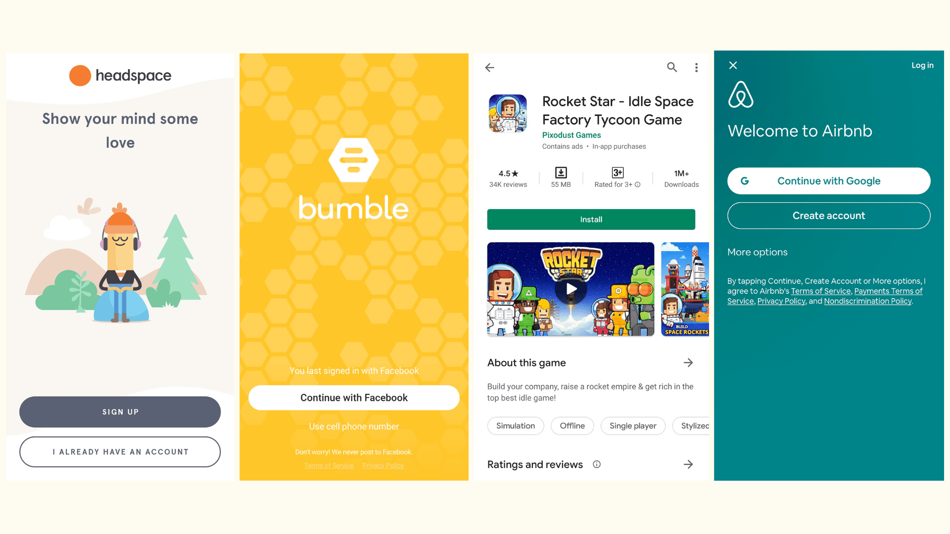
Example 3

Example 4
Wrapping up
We have covered everything from scratch about call-to-action buttons. From what they are to how to optimize them for higher conversions.
This article will serve as a complete guide for making compelling, persuasive and high conversion CTA buttons. Follow us for more such informative guides and feel free to reach out to AppMySite for further details on CTA buttons or anything related to the world of mobile applications.
