There are about 2.2 million mobile apps on the Apple app store and around 2.8 million apps on the Google play store. This number is only growing and that too at a massive scale.
With the growing numbers of mobile apps, the app store has become nothing less than a battleground where every single mobile app is fighting for its space.
In this cut-throat environment, you must ensure that not only your mobile app icon stands out from the crowd but is also compelling enough for users to download the app. The very least it should do is to get them interested in your app.
If you are looking to convert your WooCommerce website into mobile app then you must pay utmost attention to details, and a very critical element of the mobile app design is the app icon.
In this blog, we will discuss the importance of an app icon and how to create successful digital icon designs that promote your apps for better search result ranks.
In the blog
- Why are app icons important?
- What is the importance of a compelling icon design?
- How can app icons boost your app store ranking and visibility?
- How to design aesthetic app icons?
- Basic tips for designing the best app icon
- Use a minimalistic design
- Keep it simple
- Select colors wisely
- Maintain originality & authenticity
- Test the icon on different wallpapers
- Follow design guidelines recommended by app stores
- Conduct A/B testing of your best designs
- Final checklist for app icon optimization
- Frequently asked questions
Why are app icons important?
It is well known that “the first impression is the last impression” and in regard to mobile app icons, we couldn’t agree more.
Due to the sheer number of mobile apps in the market, you do not get a second chance to make an impression upon a potential client.
The app icon is the first thing that a potential customer notices about the app. In fact, as per a study by SplitMetrics, a well-designed and optimized app icon can increase the chances of conversions up to 560 percent.
Thus, your app icon must intrigue, tell a story, and more importantly evoke certain emotions in the users and them curious enough to find more about your app. Most importantly, it must pictorially represent your brand and what you stand for.
What is the importance of a compelling icon design?
Icon designing is a critical phase that requires an in-depth brainstorming and understanding of not only what your business is about but also your target audience. Whether your business is a blog or news, an eCommerce website or solves a different business problem entirely, a thorough insight is important.
The best approach is to revisit the basics, which we will discuss later in this article.
That being said, the icon design must also be simple enough to convey the message immediately and accurately. As a good rule of thumb, if a user spends more than 5 seconds to comprehend your app icon, they’ll move over to another app in the market.
Therefore, it becomes even more imperative to design a compelling app icon that outshines your competitors.
How can app icons boost your app store ranking and visibility?
The mobile app icon is not only important as it is the representation of your mobile app and your brand but also because it plays an important role in the App Store Optimization of your mobile application.
In fact, as per a study, icon updates were the second most frequent form of ASO at 30 percent, up by 24 percent year over year.
Clearly, a well-designed and appealing icon will attract a lot of visitors and compel them to install and use your app and will indicate the app store markets that your mobile app is being well-received by the audience.
This will eventually result in increased search result rankings for your app which will in turn help increase the number of downloads and visitors to your app listing page.
Suggested read: App Store Optimization Guide – Get 10000+ app downloads in the first month
How to design aesthetic app icons?
Designing aesthetic app icons should be treated as one of the most important steps in the process of app designing and development. While there is no absolute answer to the question above as all businesses are different, some things remain constant.
The icon should represent your unique brand image, convey its inherent story, signify the app’s purpose, appear outstanding on a user’s device screen, and inspire users to download and launch the app.
There are several ways and methods that you can use to create a compelling and attractive app icon design. This may include:
- Hiring professional designers to create your app icon
- Creating your own app icon using free or paid app icon design tools like Iconsflow, Adobe Illustrator, etc.
Else, you can also make an app with AppMySite and avail either of the options listed above. Here, you can create your own icon with easy DIY tools, upload an existing icon or hire their professional designers to create an app icon for you while you build the rest of the app. You can read the blog below for more information.
Suggested Read: How does AppMySite simplify app design?
Basic tips for designing the best app icon
Here we will discuss the basics of app icon design and many other tips for creating a compelling app icon for your mobile application. These tips are from the industry experts and come straight from their experience of making multiple mobile app designs.
Do note that these tips and tricks are to be followed only where applicable. Since the design is a greatly subjective topic, your own instincts and creativity will take you a long way. Originality is of utmost importance.
The following are some of the best tips, tricks & industry practices to direct you towards success.
Use a minimalistic design
Have a minimalistic design as much as possible. Not only is it in trend but it also promotes easy brand recognition.
An app icon with too many elements can create a lot of confusion in the audience and tends to not convey the message easily. The app icon should be simple to understand and not complicated.
For instance, the above app icon by Headspace is a great example of minimalism. It is a meditation app, and the minimalist approach in design effuses the message of “decluttering” which is a very important element in meditation.
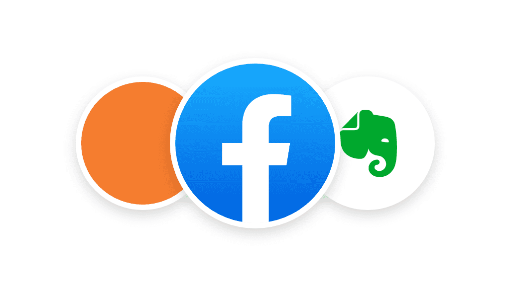
Facebook’s app icon with an “f” on a contrasting blue background is another great example of minimalism. The letter “f” is sufficient to denote the recognition that the brand enjoys all over the world, as people recognize the app icon and related with it easily.
Similarly, if you look at Evernote’s app icon, it has the image of an elephant and a folded edge of a paper. While the folded edge signifies bookmarking (the age-old technique of folding book pages), the motif reminds us of the phrase “the elephant never forgets”. Thus, the icon beautifully conveys the purpose of the ‘note taking’ app.
Designing a minimal app icon is also important because audience’s attention is very fickle, and they will not take a second before switching to a different app. Thus, over-complicating things will lead to a desperate need for longer attention and work against you in the long run.
We understand that it is not easy to create a clean & minimal design, but a good approach is to include all the main elements and then filter them one by one based on the importance and relevance to the brand.
At the end of the day, the icon should convey the message in the lowest number of design elements as possible.
Keep it simple
As discussed earlier, minimal design is not only easily recognizable but also very simple to understand. It makes it very simple for the audience to register the design in their memory.
A simple to understand design greatly increases the brand recall value and conveys the message easily. An overcrowded icon with too many colors, fonts, and other design elements will only create confusion in potential customers’ head.
For instance, just go through the icon designs listed below. Do they appear complicated or easy? Does each icon speak to you even without the sub-text or icon label?
It does, right?
Just pick up your mobile device and take a look at the icons of some of the inbuilt apps. The Phone icon makes it obvious that the app is for making calls, the Camera icon makes it obvious that the app is for clicking pictures, and so on.
This is the case because these icons are simple and universal in their appeal. Whether it is the app icon, or icons to denote different screens and features within an app, it must have this potent quality.
Simplicity has been a major contributor to the success of many mobile apps in the past. So, just keep this factor in mind when you design your app icons and test them for quality and likeability.
Select colors wisely
This is one of the most important factors that decide the fate of the app icon’s success and eventually the success of the mobile application.
The color palette you select can create a long-lasting impression on your users. Make sure that it very well compliments the colors of the mobile app UI and the brand themes. This ensures that there is no conflict in the mind of your users.
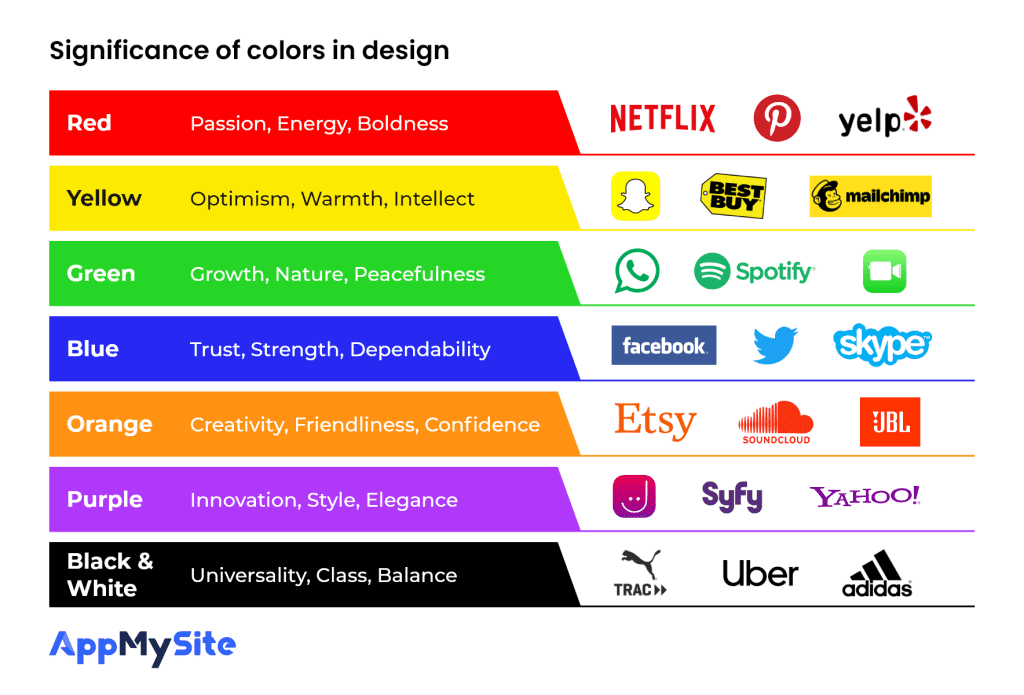
Do understand that different colors invoke different emotions. Colors are always strategically selected based on the response from the target audience. Think of the colors that will get you the maximum attraction from your audience.
Have a look at the chart below to understand the impact of colors on your audience. Understand how different colors can be utilized to evoke certain emotions.
Lastly, do not forget to research what colors your competitors are using. Most probably they have selected colors that get a good response amongst your target audience. This also helps you get inspiration from your peers in the industry.
That being said, do note that taking inspiration is fairly different from copying someone’s design. We will discuss how copying anyone else’s design is a bad idea and can cause more damage than any good, in the next section of this article.
Pro tip: It is always a good practice to have a background color for the icon so that it doesn’t blend with any other background when downloaded on a user’s mobile devices
Maintain originality & authenticity
As discussed earlier, make sure that your design is original and is not already being used by anyone else. This is a must-do since having an icon similar to anyone else’s design will not only bring negative credit for your brand but will also help increase the recall value for your competitor’s brand.
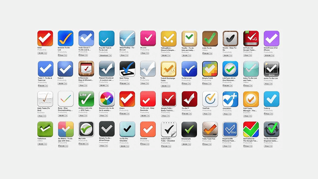
This becomes especially important when your app belongs to a common or popular category. For instance, the icons in the image below all denote a “To-do” app and a user searching for a category like this will see many similar icons. Thus, all the icons will start competing for attention.
You do not want anyone to look at your app icon and remember someone else’s mobile application. Having an original yet appealing design will build recall value for your own brand and bring a lot of attention from your target audience. It’ll help your app stand out in the market and help improve the audience engagement multi-folds.
Pro tip: Avoid using stock images, shapes, and photographs. There is a great chance that someone has already used this freely available design for their app icon.
Test the icon on different wallpapers
The mobile app goes from the app store to your clients’ mobile devices. Which is why you must ensure that you test the app icon design in different backgrounds and not just the app store listing page.
The app icon should stand out in different wallpapers and different color backgrounds.
Many mobile devices have the option to set the shape of their apps as well, make sure that you test that your design suits all shapes, be it square or a circle.
Follow design guidelines recommended by app stores
Sometimes even great looking designs do not look so good when constrained in specific dimensions. This is why you should make sure that your design or the brand logo looks good across all dimensions or alternatively design the app icon based on your brand logo such that it represents the brand and also appears appealing in the app store market and also fits within the mobile device as well.
The app store pre-defines the size specifications for the app icon design files. Make sure that you follow these specifications at all times. Below are the design size, format and resolution specifications listed for both Apple App Store and Google Play Store.
Apple App Store requirements
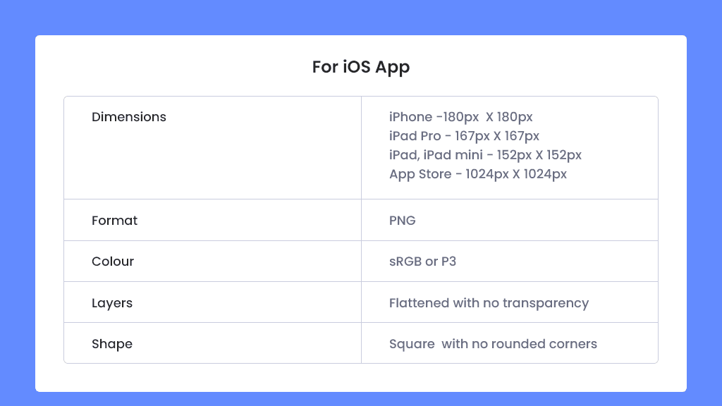
- iPhone: 180px × 180px (60pt × 60pt @3x) | 120px × 120px (60pt × 60pt @2x)
- iPad Pro: 167px × 167px (83.5pt × 83.5pt @2x)
- iPad, iPad mini: 152px × 152px (76pt × 76pt @2x)
- App Store: 1024px × 1024px (1024pt × 1024pt @1x)
- Format: PNG
Google Play Store requirements
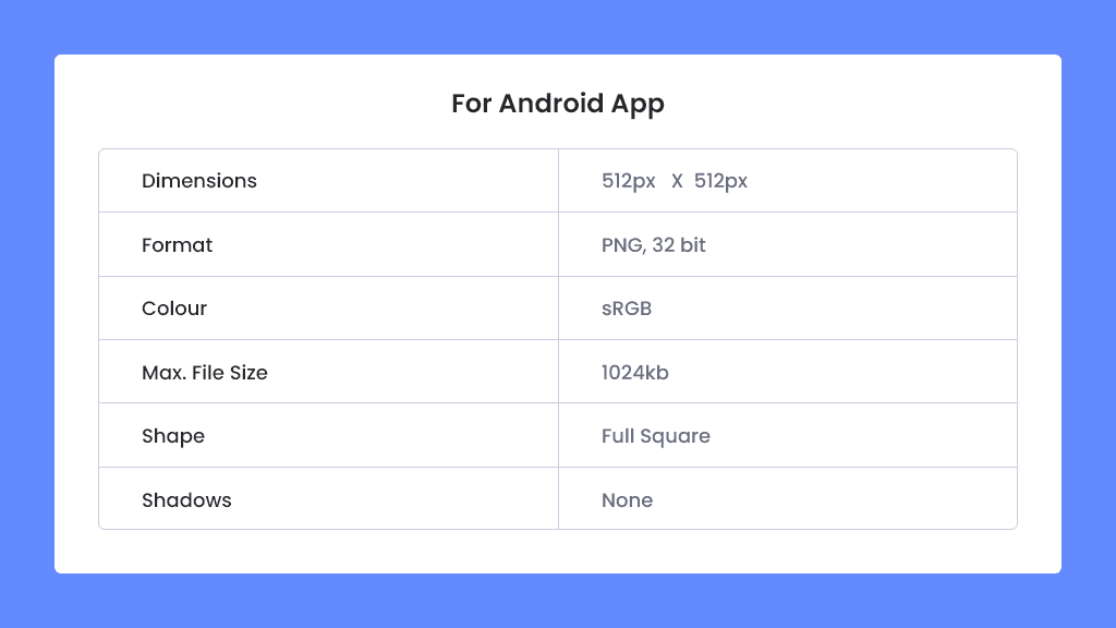
- 32-bit PNG (with alpha)
- Dimensions: 512px by 512px
- Maximum file size: 1024KB
Conduct A/B testing of your best designs
We all know that design is highly subjective and no one knows the sure shot solution to a perfect app icon design. And, by the end you’ll have multiple design options to go for. In this case, you can leverage the power of A/B testing to your advantage.
This is the best way to figure out the best design for your mobile app. Studies have shown that A/B tests have increased the app page performance by up to 26 percent.
Release different designs to different sets of your target audience and judge by the response each design gets.

Final checklist for app icon optimization
Now that we have discussed the best practices and top tips for the perfect app icon design for your mobile app, here’s a final checklist for your reference. These points summarize the guidelines discussed above that you must implement every time you design an app icon.
1. Meet the size & format specifications
2. The icon must represent your brand
3. Right colors for the right audience
4. Originality in design
5. Competitor research & analysis
6. Simple and easy recognition
7. Test, take feedback & optimize further
Conclusion
Mobile app designing can be a daunting task at first in your app strategy. Therefore, we have broken down this mammoth task into simple chunks so that you can easily design the app icon for your mobile application.
AppMySite mobile app builder offers complete control over your mobile app design and layout and functionality. With easy to use interface and multiple features and functionalities, you can now easily design and build your mobile app for your blog for free with AppMySite WordPress mobile app builder.
Frequently asked questions
Have questions about app icons? Here are some answers to commonly asked questions about the importance of app icons.
What is the purpose of an app icon?
The purpose of an app icon is to technically represent your application on a smartphone device. Mobile users can only see application icons on their devices. Even on app stores, an app icon helps you make a lasting first impression. The purpose of an app icon is to represent your application in the most engaging way possible.
Why is the design of an app important?
The design of an app is important in determining how it looks and performs. The way you design your app determines how it looks to the final user. An app that looks bad doesn’t make a strong impression on your app users and may even reduce app retention and session time.
App design also determines the user experience the application offers. Your app’s layout, navigation, and load time are determined in large part by the way your app is designed. These aspects of your app affect your user experience.
Why are icons so popular?
App icons are popular because most users identify applications via their icons. Users launch apps on their devices by navigating to the app icon. Thus, icons that are engaging and leave a lasting impression on users help build upon the experience that the actual application delivers. Think of how synonymous app icons associated with popular apps are. You can achieve something similar by designing a good app icon for your own application.
What fees will I have to pay for icon design?
On AppMySite, you can create an app icon without paying any fee for the design. If you decide to hire a UI/UX professional to design an app icon for you, you would need to pay for the services provided. Generally, app designers charge $50-100/hr. The final cost will depend on the number of hours a UI.UX designer will spend working on your app icon.
What should I do if another designer steals my design?
If you’re a designer and think that your work has been stolen by another company or professional, here are the steps you should follow:
- Make sure your design work is protected by copyright law. You can do this by simply publishing your artwork or design on Behance. Your design will then be protected by common law copyright.
- Verify if your work has actually been copied. In some cases, another design professional may create derivate designs based on your work. This cannot be constituted as copyright infringement as other professionals are allowed to use another design or artwork as inspiration to create something new. You should thus make an assessment on whether someone has actually stolen your work, or simply created derivative designs.
- If you’re sure that another professional or company has copied your work illegally, send them a cease and desist letter. It’s a good idea to consult a lawyer in order to draft it.
