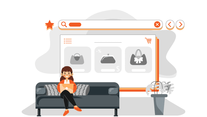
The internet has emerged as the new super huge market place and more people are shopping online than ever. Brands are competing with each other by creating websites and apps that stand out and manage to get the attention of potential customers.
However, bagging this achievement is not easy. With endless opportunities, the web also brings endless competition. Therefore, every online store must aim to achieve perfection in various departments and offer a matchless experience to their customers.
While there are n number of factors that can affect and shape this experience, the product page design and appearance remains a vital and critical one.
So, today we are here to help you ace the same. Read the blog till the end and discover some great tips for designing your product pages. Add more aesthetical and functional value to your online store and earn more conversions.
Anatomy of perfect product pages for the perfect scores
Visual merchandizing is not just important for physical stores and outlets. The showcasing of your products on your online store plays an equally important, or arguably a more significant role in the success of your eCommerce business as the products remain intangible and buyers can also see and decide.
The perfect product page is an ensemble of many important elements. This mainly includes the following:
- Product name
- Product images and/or videos
- Product description & specifications
- Pricing and delivery related information
- Customer ratings, reviews, photos, videos, etc.
- Alternate product options (color, size, etc.)
- Related or recommended product options
- FAQs and other detailed information
It is important that each element is treated with utmost importance and placed strategically. While this may sound simple, it can get really challenging and complex to achieve.
Consumers have become smarter and more demanding in the age of smartphones and affordable internet. Therefore, scoring a perfect ten in all segments can be tough even for platforms like Amazon and eBay.
For instance, some product pages fail to impress customers because they lack information. In fact, as per a study by Salsify, around 70% online buyers agreed that they had abandoned product pages on a retailer’s site because there wasn’t enough information.
Many customers may also abandon a site if it lacks social proof like ratings and reviews. Basically, a poorly designed product page can turn customers away and increase your bounce rate.
However, this does not imply that you cannot overcome these challenges. As discussed above, one can always aim for perfection and try to get an edge over their competitors.
In fact, when done right, you can attract more sales and inspire more conversions with your product pages. Your products deserve to be displayed elegantly and strategically and this blog will help you achieve the same.
10 tips that can bring you closer to the perfect 10!
Now let us discover some strategies and suggestions that you can implement to design eye-catching product pages. Go through the ten tips listed below and design your product pages like a pro:
#1: Ensure easy navigation & discovery
Before designing a great product page, you must ensure that your buyers are able to arrive at those product pages without much effort. For that, you will have to design a frictionless and easily navigable website or app.
Create a clean and well-thought hierarchy of categories, sub-categories and more. Arrange and group your products in these categories strategically. Design an interface that redirects users to the next step automatically and also add smart search and filter options.
Suggested Read: Mobile app navigation: Best practices to enhance your UI and UX
#2: De-clutter and clean the page design
Less is more! Keep this philosophy in mind when you design the product pages. While you must include every important information, cluttering the page with too many elements and unnecessary text can actually backfire.
No product page should appear like “too much work” for the customers. Clean the page design and use ample white spaces. Give breathable space to all your important design and content elements and let each of them stand out. For instance, if you are using multiple product images, then place each of them separately or club them in a slide.
#3: Add responsive & high-quality media
Product image is likely the first thing that your users will notice when they land on the product page. Therefore, you can treat it as the most important element and work on it accordingly. Use professional help if needed but ensure high-quality product photos.
You can use multiple photos to give a multi-dimensional product view to your users. Additionally, you can also use interactive videos that make the experience more elaborate and dynamic. Make sure that all the media you use is responsive and compatible across all devices and screen types.
Suggested Read: A brief guide to handling images on your WordPress website
#4: Pick captive color palette & typeface
The choice of colors, fonts, etc., can also affect the visual appeal of your product pages. While you must keep your brand specific theme intact, you can get a bit experimental with colors and fonts on the product pages.
Pick colors that remain in contrast with your product images and make it appear more enhanced and attractive. When it comes to font, give more weight to the content that you want your customers to notice first. You can use bold font, highlight it, or take inspiration from brands that are doing it right.
Suggested Read: The significance of colors in mobile app development and marketing
#5: Use smart & obvious Call to Actions
The call to action button tells your users how they can proceed and what action they can commit next in their journey. The CTAs become more important on the product page as users click on these buttons to bag products, make payments, checkout, and more.
Therefore, well designed CTAs can drive and inspire conversions. Make sure that these CTAs are obvious and easy to understand, and convey your messages clearly. You can also localize these buttons to suit your niche and the nature of your targeted audience. For example, Amazon uses the “Add to Cart” button in the USA and “Add to Basket” in the UK for the sake of localization.
You can try similar customizations and place these well-designed buttons in a prominent and easy manner. When designing for mobile, it should be within easy access of the thumb. Place the button somewhere above the fold and keep other details below.
Suggested Read: Call-to-Action buttons – All you need to know about high conversion CTAs
#6: Add details that matter & motivate
Your product details and description can determine what the buyers perceive of your products and inventory. So, write concise but compelling copies. While you can take the creative liberty to the fullest, do not miss out any important detail or highlight in the due course.
Start with writing a catchy title that grasps your users’ attention and makes them feel like this is what they were looking for. You can use relevant keywords and tags to make the products easily identifiable and discoverable.
Back your product title and descriptions with other details like the price, stock meter (how many products of that kind are left), brand and seller info, discount and other offers & deals, quality and material specifications, potential advantages, customization options, how the product should be handled, etc., depending upon the product.
#7: Suggest relevant products
In order to use your product page to the fullest, you must think beyond the basic listing. In fact, you can cease this opportunity to push other products while users are browsing for one product of their choice.
You can suggest relevant products, recommended products, alternates, related products, and more. You can also bundle products that go together and sell them as a package. This will enable you to cross-sell and up-sell and increase your conversions ultimately.
Do not forget to attract the attention of your users by creating a feeling of temptation and urgency. Give them FOMO by using phrases like “N number of people have already bought this; This product is running out of stock; Hurry, only n units left”, and more.
#8: Add multiple proofs for confidence
Social proof, reviews, ratings, etc., can help your buyers to make purchase decisions faster. It can also impart confidence in your customers and make them believe in your products and trust your brand.
Therefore, make sure that all your listings have ample ratings and reviews from genuine customers. You can also invite real product images and videos from customers who have already made a purchase. Additionally, you can also add testimonials and data that back your claims and enable new buyers to trust the product and purchase it.
Suggested Read: Know how ratings and reviews can optimize the success of your mobile app
#9: Allure with discounts and deals
You may place multiple advertisements and create endless campaigns for your customers and offer ample deals, offers and discounts. However, ultimately it is the product page that makes all those offers and deals count.
So, list such offers clearly on your product pages. You can also show customized deals and suggestions based on the users’ loyalty, average order value, behavior, product preferences and more.
Design your product pages and checkout screens in such a manner that it makes your customer’s journey smooth and effortless. Make them feel rewarded at every step and win their loyalty and trust.
#10: Extend assistance to help customers
You can walk that extra mile and use your product pages to engage your customers further. It will only increase your chances of conversion and reduce the risks of abandonment.
For instance, you can use the chat feature and give a one click support option to customers. Add phrases like “Have queries regarding this product? Chat with our executives and find answers instantly”, and hook the customers to the experience.
Make them stay with the right strategy and grab their attention through multiple means at several instances. Make them feel empowered and informed and motivate them to convert and make more purchases on your store.
Suggested Read: The unlimited benefits of integrating chat feature in your mobile app
Need an app for your e-store? Here’s how you can design it yourself!

Viewing products is easier and more fun on mobile apps. As customers scroll more and view more, they end up buying more. So, create an app immediately if you do not already have one.
The good news is that you can make your own app with AppMySite’s online app builder in no time. It’s affordable, it’s super easy and it’s quick! Basically, it is all that you can ask for!
With AppMySite, you can design your own app with the click of a few buttons and toggles. You can bring your entire website design to your app or customize it the way you like.
Enjoy building an app that your customers fall in love with. Do not just take our word for it! Go ahead and build your app for free to savor the experience. You can read the blog suggested below and get all the help you need.
Suggested Read: How to build an app without coding?

