Mobile apps have become the ultimate marketplace for all brands. Any business or service is incomplete without a high-performing app today.
It is also notable that DIY tools like AppMySite have made it easier to convert WooCommerce to app without much effort.
Suggested Read: How to create an app without coding?
Evidently, the app industry is evolving everyday and it should be the aim of any business to stay updated with the trends. This helps in keeping your app updated and aligned with the times.
We discuss many significant aspects of mobile app design and promotion regularly. You can follow our blogs to know about the same.
Today, we will tell you about yet another significant aspect of mobile apps – Navigation. Stay tuned and find out all about it.
The basics of mobile app navigation
The minute someone downloads, installs, and launches your app, their journey with your brand begins immediately. Therefore, their end-to-end experience should be rewarding and thoroughly gratifying.
In fact, a study says that 25 per cent users abandon an app after the first use. Hence, it becomes even more important to hook their attention from the very start.
It is the navigation and menu design of your mobile app that determines the user experience as they move from one point to the other in the mobile app.
Ensuring a good mobile app navigation experience and enhancing it can become quite challenging due to the limited screen space. However, it is definitely plausible and achievable.
All it takes is a good and thorough understanding of the concepts, excellent design, and a high performing native app build. In fact, smooth and frictionless navigation can be the ultimate key to your success.
Role in enhancing app performance
Mobile app navigation has a greater role to play than what any regular user can imagine. An app capable of intuitive navigation helps users sail through the app effortlessly and get what they aim for.
Based on the structure and functionality, navigation can be of three basic types:
1. Hierarchical: Here users are mainly offered one action per screen and they can retrace or start from the beginning.
2. Flat: Most of the primary functions and categories can be found on the same screen.
3. Content-driven: It is highly analytical, intuitive and logic driven and determines next steps based on the previous step or contents of the app.
Example: Gaming Apps
Let us now discuss the impact of navigation on the UI and UX of your mobile app:
Impact on User Interface
The navigation is an integrated part of your mobile app and ultimately determines the quality of the UI (User Interface).
It helps with the flow of information, makes contents more accessible and lets users complete their tasks. Hence, it is important that you visualize the app and establish your navigation in the prototype.
It helps users in making progress in the app and leads them to the ultimate goals like conversions. However, poorly design and complicated navigation will lead to in-app chaos and humdrum.
Impact on User Experience
As the user interface and user experience of your app are co-related, navigation impacts both. In fact, it plays a huge role in making the user experience smooth and remarkable.
Whether your app category list is as huge as giant online retailers like Amazon, or quite limited like the grocery app for the outlet next door, navigation determines how users will respond to it.
An app with smooth navigation will set the tone and enhance the user experience. On the other hand, poorly designed navigation can infuriate users and lead to uninstallations and abandonments.
Conclusion
Considering the factors listed above, we can say that you cannot risk implementing a sloppy navigation in your mobile app. In fact, a good navigation is important for the reasons listed below:
- Helps users get well aware of the nuances of your app immediately
- Lets users experience your app thoroughly without any complexities
- Brings out the core features and functionalities of the app more clearly
- Leads users and redirects them intuitively to desired destinations
- Ensures rewarding experience leading to more sales and less abandonments
Some basic patterns of mobile app navigation
A perfect app is a mix of several navigation styles. You can research for the popular app navigation formats and do primitive A/B testing to finalize your type.
Some of the most popular navigation patterns are as follows:
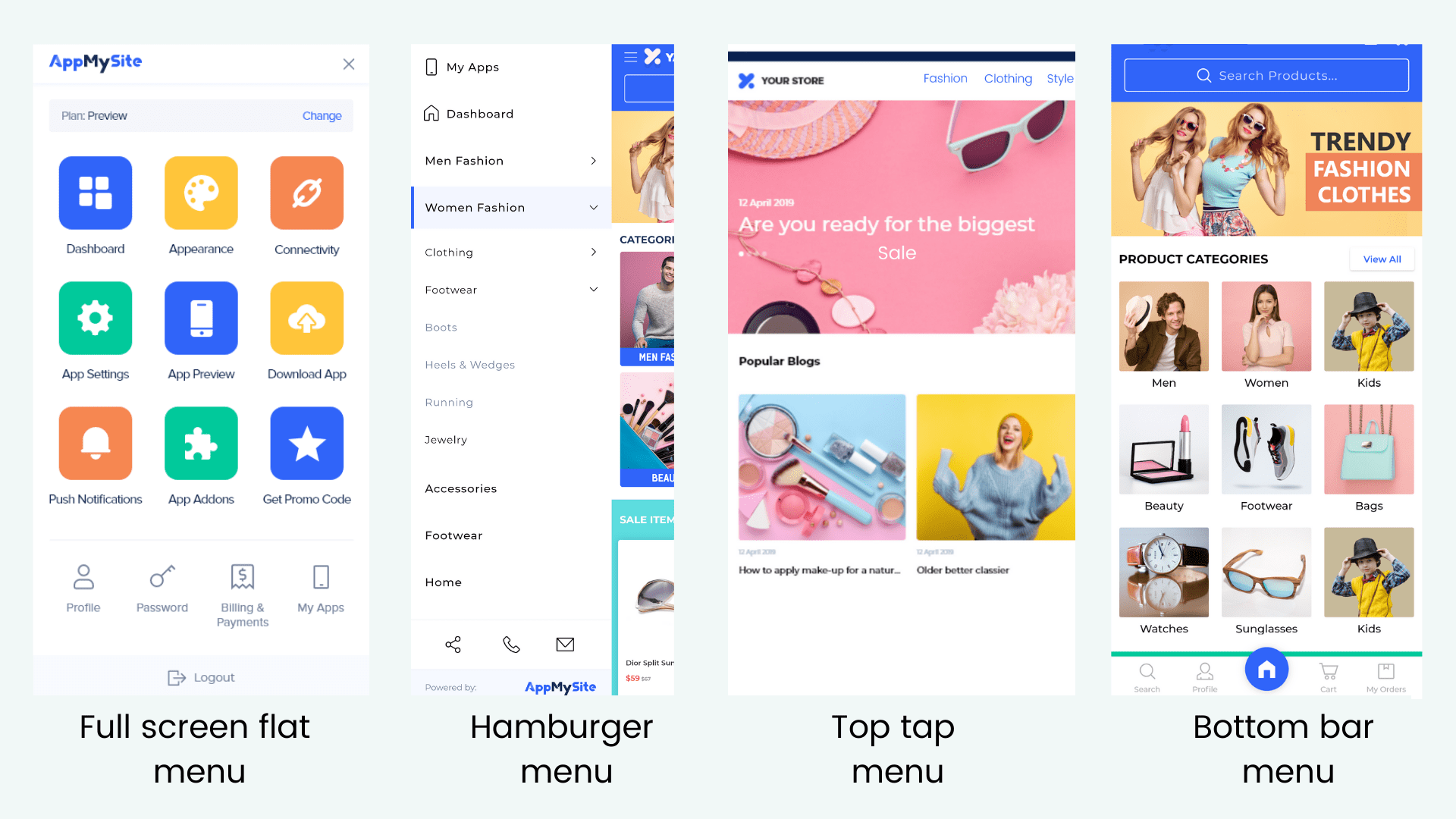
#1: Full screen flat menu navigation
You can use the entire screen to help users navigate through the contents of the app. However, it is suggested that you use well-defined categories with images.
This type of navigation suits best for educational apps, or apps with limited content types, pages, categories, etc.
Example: The NASA App and Yummly App are great examples of full screen flat menu navigation.
#2: Hamburger menu navigation
It is also known as the list type menu. Hamburger navigation is one of the most popular types of navigation patterns these days. It helps clean the main screen while keeping the menu easily accessible.
A compact action button is usually placed on the top of the screen (usually defined with three horizontal lines), which upon clicking, opens up a list of the menu contents.
Example: The New York Times App and Instagram App extensively use the list type menu.
#3: Top tab menu navigation
The top tab menu is often used to highlight some unique features on the top of the app screen. It suits the best for search tools and other eye-catching significant functionalities.
For instance, Quora has options like Feed, Bookmark, Links and New Questions placed on the top of the app screen. It makes these features easily and vividly accessible.
Example: The Facebook App and The Quora App have distinct tools placed on the top tabs.
#4: Bottom bar menu navigation
The bottom bar menu suits the thumb-friendly navigation the most. It is commonly used as a navigation tool in screens that do not have a distinct hierarchy.
It is often displayed using visual and recognizable icons placed on a tab or bar at the bottom of the app screen. There should not be more than five icons on one palette and text can be avoided.
Example: The Twitter App and The Dropbox App have distinct bottom bar menu navigation.
#5: Gesture-based navigation
Gesture based navigation allows users to take actions and navigate through apps using fingers for gestures. It is commonly used to zoom-in and zoom-out screens.
In terms of navigation, it can make the user’s job really easy. For instance, the “right swipe” and “left swipe” options on Tinder allow users to make the decision and navigate further.
Example: The Tinder App and The Google Maps app come with gesture-based navigation.
Tips to ensure frictionless navigation in your app
In order to ensure seamless navigation in your mobile app, follow the tips listed below:
#1: Set up a distinct hierarchy
A distinct and well-organized hierarchy is particularly important for a smooth navigation experience. It helps users explore the app with a funnel approach, thereby filtering the unwanted and leading to the destination with every step.
It also helps users determine the next natural step and makes the task easier. Prioritize the app content and give visual weightage to the contents accordingly.
Organize every element, screen, category, sub-category, tab, image, etc., in organized sets with clear instructions.
#2: Reduce cognitive load
Your aim as the app provider should be to make the task easier for your users. It should not leave the users thinking and lost at any stage.
The designs should be obvious and not very unconventional. You can also keep the website and app design identical for ease. The ultimate idea is to make the process intuitive enough.
In case of zero states (errors, mistakes, wrong inputs, etc.), the response should be friendly and guide users what to do next.
For instance, if a user inputs wrong keyword, you can tell them to spell check or type relevant tags. This will reduce your bounce rate and abandonments.
Also note that if the transitions are not smooth enough, the whole idea of frictionless navigation gets negated. Keep the transition type such that it suits the features and functions.
For instance, you can use vertical scrolling for viewing products under one category, and use horizontal transitions for viewing multiple images of the same product.
#3: Declutter the screen space

While it is important to give ample visual importance to significant elements, never “over-do” anything. Try to keep your app tidy and smooth.
The design and layout should be easy on the users’ senses. It should not look stuffed or congested. The app real estate should be clear of irrational content in any case.
Use minimalistic approach and customize the app according to users’ preferences. Avoid giving too much information on one screen and dedicate separate spaces for different types of content.
For instance, you can limit one screen for one action and also have skeleton screens (temporary splash screens when something is loading).
#4: Follow the thumb rule
Conventionally, mobile app users make excessive and the most use of their thumbs to navigate their app. As you design your app, you can focus on this aspect the most.
As they are more likely to place their thumb in the lower half, place significant buttons there. Use this space for most common icons, actions, and buttons.
Also optimize visual and creative elements like the size, shape, color and design of those buttons and icons accordingly. However, do not over-project and focus on making the transitions smooth.
#5: Add a search or help bar
A search bar also comes in handy for almost everything. You might want to project everything, but consumers do not like the same.
Therefore, including a distinct search or help bar in your app will help you keep anything the users want, at bay. The search bar should be user-friendly and capable of predictive analysis. Add a box or define it with icons like the magnifying glass, question mark, etc., to redirect them.
Use common and logical product attributions and keywords to define your products and to make everything easily searchable.
Shed the strain with AppMySite mobile app creator
This was our elaborate guide to help you ace the design department of your mobile app. However, if the entire process sounds overwhelming, then we have a better solution.
Simply sign up for AppMySite mobile app builder for native iOS and Android apps apps and build your own app without any hassle. It is simple, intuitive, easy, and affordable.
The free online app maker comes with a “ready to build” code-free dashboard that makes app building a breeze. It enables you to sync your app with the website and auto-populate the content.
The apps built are all quick, responsive, and native and it uses multiple navigation structures and styles to make the experience smooth and reckoning.
So, what are you waiting for? Bid adieu to the hassles of custom app building and embrace the modern solutions. Create an easily navigable and high-performing app with AppMySite now!