It is the age of smartphones and every business is aspiring to join the mobile industry. With the increasing number of apps on the app stores, the competition is also increasing.
It is not enough to just create an appfrom website for Android and iOS. In fact, it has become more important than ever for businesses to stand out and create a mark of their own.
However, while focusing on the larger picture, people often miss out on the little things that sum up to matters of acute importance.
In order to grab the attention of their potential users, businesses must focus on all the nuances related to their app. This list must also include the factors related to the aesthetics of your app and marketing campaigns.
Mainly, the design, layout, color themes, images, graphics, videos and font style make up for a large part of the aesthetics.
Suggested Read: Importance of app icons – The most overlooked element of a mobile app design
While we already have, or will, discuss some of the factors in our other blogs, today we will talk about the importance of colors in mobile app development and marketing. So, explore the blog further and find out more.
The aesthetics define the identity of your brand
It is evident, that colors play an important role in perfecting the image of your online brand. As most of the internet is all about what people see, the significance grows even more dense.
From app development and design point of view:
In an app, colors define many things like – the brand logo, app icon, app screens, category tiles, visual elements, CTA (Call to Action) buttons, and more.
Even as you upload the app to the app stores, the screenshots and app icon give a gist of the app to the store visitors. It influences the potential users to download your app.
Therefore, we can say that colors help in setting the tonality of the app and ultimately, affect the design and development aspects of the app.
From marketing and sales point of view:
According to a study, 92.6 percent people agreed that they give importance to aesthetics while making a purchase. It reveals many other interesting facts related to the importance of colors.
It also shows that as you endorse your app on different platforms, like social media for instance, the visuals play an incredibly significant part in grabbing the attention of your users.
Conclusion:
Clearly, we can say that colors play a significant role in both, app development and promotion. The importance has further been summed up and listed in the section below:
- Colors can grab the attention of potential users and can also turn them away
- Colors can influence the attention rate and span of users
- The appropriate colors can make your app and your products look appealing
- Colors and themes affect the decision making process of buyers
- The color choices depict a lot about the brand’s objectives
Colors carry a tale of their own
The universe of colors is quite vast and has been a matter of huge interest and scientific studies since ages. The science and psychology of colors is strongly taken into consideration by brands and businesses, for a variety of things.
Although, different people of varied backgrounds often perceive the colors differently, some beliefs remain same. For instance, the following list of things can primarily affect the choice of colors:
- Sociocultural beliefs
- Age, gender, and orientation
- National standards of color coding
- Personality based individual choices
However, if we go by the global standards, some interpretations and attributions of different colors stand common. Global brands choose their themes according to these standards of design.
Broadly speaking, each color carries a hidden message of its own, and someone’s choice of colors speaks volumes about the statement they desire to make through their brand or business.
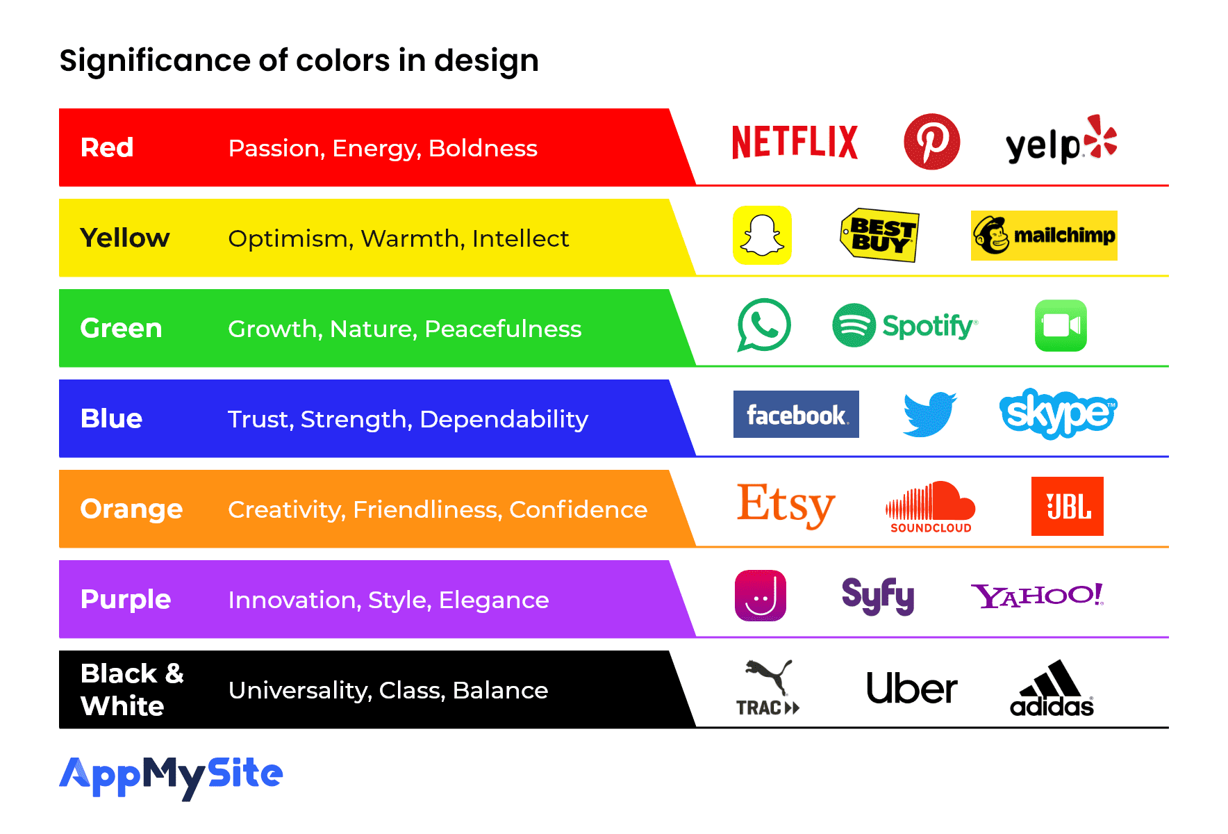
For example, healthcare and skincare brands often have ‘Green’ as their central theme, whereas the brands corresponding to modern technology often have a ‘Blue’ theme.
The infographic above elaborates the meaning of some common colors. Some examples of the common brand icons in the respective colors have also been listed parallelly.
For example, we can see that ‘Red’ denotes passion and energy that appeals more to the young age. The popular video streaming app Netflix has a red and black theme overall.
Whereas it is also notable that some apps like Instagram have an app icon with multiple colors. In this case, they often tend to show their vibrant side and convey more than one central theme.
Based on the potent message and the theme of your brand, you can choose the relevant colors for your app icon. You can also mix several colors and keep whatever suits best for your brand.
The theme of an app can affect its success
The importance of colors goes beyond that mere visual pleasure. As discussed above, every color has a meaning of its own.
Eventually, the color theme that you choose for your app and your marketing campaigns should be perfect on many levels. You can let creativity take charge and create a theme of your own.
Else, you can take the help of some general predefined color themes, as defined in the theme guide below:
Theme Guide
Have you heard of the 12 spoke color wheel? The color wheel is considered as an important instrument when it comes to determining the theme of the app.
Based on these primary colors, you can choose from the following themes:
- Monochromatic: A palette of similar shades and hues makes up for a monochromatic theme. Such themes make up for a minimalist design and are easy on the eyes.
- Analogous: Analogous theme is created using three adjacent colors located on the twelve color bespoke. One distinct color is used to make something stand out from others while also showing relativity.
- Complementary: The two colors that stand opposite to each other on the color wheel are known as complementary colors. These colors can be combined to grab immediate attention and used in places of utmost importance. Example: CTA buttons
Also Read: Call-to-Action buttons – All you need to know about high conversion CTAs
- Contrast: Contrasting colors can be used to build a theme when you want to establish something. For instance, when you wish to make a text clearer and more readable than the other elements on screen.
- Custom: You can defy all the color patterns and themes and choose a custom theme of your own. This can be done when you have special requirements or some special statement to make.
Factors that must optimize the selection process
Still wondering how to choose the right colors for your mobile app? Go through the list of the following factors that you must consider as you proceed to choose the theme of your brand.
#1: Identity of the brand
The first thing that you should consider is the identity of your brand. ‘What is your brand all about and which theme reflects its image the best’ – should be your primary focus.
You can also choose the app theme based on the existing theme of your brand, website, etc.
#2: Type of the products
Also focus on the kinds of products you sell. For instance, if you sell healthcare products and medicines, a green and white theme can suit you the best.
Remember, the product images and app background should remain in good contrast at all times.
#3: Purpose of the content
You can also choose the colors based on the objective of the content and the platform you will place it on.
For instance, the colors of CTA buttons should be more distinct while the theme of your ad campaign should be more eye-catching.
Also Read: Best ideas for mobile app install ad campaigns in 2020
#4: Adaptability & Agreeability
The theme you choose should be aesthetically appealing at all times. It should also be adaptable across all devices and platforms.
You can enable night mode and also ensure that the theme choices bring out all the other elements present on the screen.
#5: Target audience
Ever wondered why most of the Hyperlinks have blue font? It is so because even color-blind people can spot this color and not miss out on important content.
Therefore, you must also consider such factors and choose colors that suit all kinds of audiences and targeted customers. Keep their background and preferences in mind as you curate special screen designs and marketing campaigns for specific customers.
Some notable examples of popular brands
Let us discuss the color themes of some popular apps and gain more clarity with relevant examples:
#1: Google Navigation App
The app icon of Google’s navigation app comprises of multiple colors. These colors are generally used in maps to represent various topographies like roads, rivers, deserts, forests, etc. Users can choose their own theme from a list of options while the basic design remains the same.
The screenshots and app screens also represent a mix of multiple colors, all corresponding to the same theme – navigation. As the app uses multiple colors, the background mainly remains white and brings out the other colors.
#2: Snapchat Messaging App
The primary theme of the Snapchat messenger app, including the app icon, is yellow. It is the most dominant color in the app and resembles the youthful vibrance and energy of the generation that the app is primarily meant for.
The different app screens use many other bold and vibrant colors and compel users to interact and engage with every feature present in the app. It also offers a dark mode theme like many other popular apps.
#3: Amazon Shopping App
Amazon has become so much more than just an online retail brand overtime. However, the Amazon shopping app has not changed much over the years and is one of the perfect examples of “simplicity with elegance”.
Blue, black and orange remain the primary colors and reflect the entire theme of the app. The background screens are such that every image and every text stands out from the rest of the content and yet remains appealing to the eyes.
Suggested Read: How to design the App Store Screenshots of your mobile app
Build an app that portrays your brand identity

As discussed at the very start of the article, the app that you develop for your business must be perfect in every sense. This will determine the success rate of your app and your marketing campaigns.
We suggest that you sign up for AppMySite DIY mobile app builder and design your own app. It is a code free app builder that enables you to create, customize and publish your own app.
Anyone can design and build their business app as the platform is completely code-free and intuitive. You can develop your e-commerce app within few minutes or spend more time perfecting it, the choice is totally yours.
So, what are you waiting for? Register with AppMySite and turn your website into an app for Android and iPhone without any hassle. Enter the app market and rule it!