Mobile apps have become the ultimate source of information, education, entertainment and also a resource for a variety of daily needs. This is true on individual level as well as industrial and organizational level.
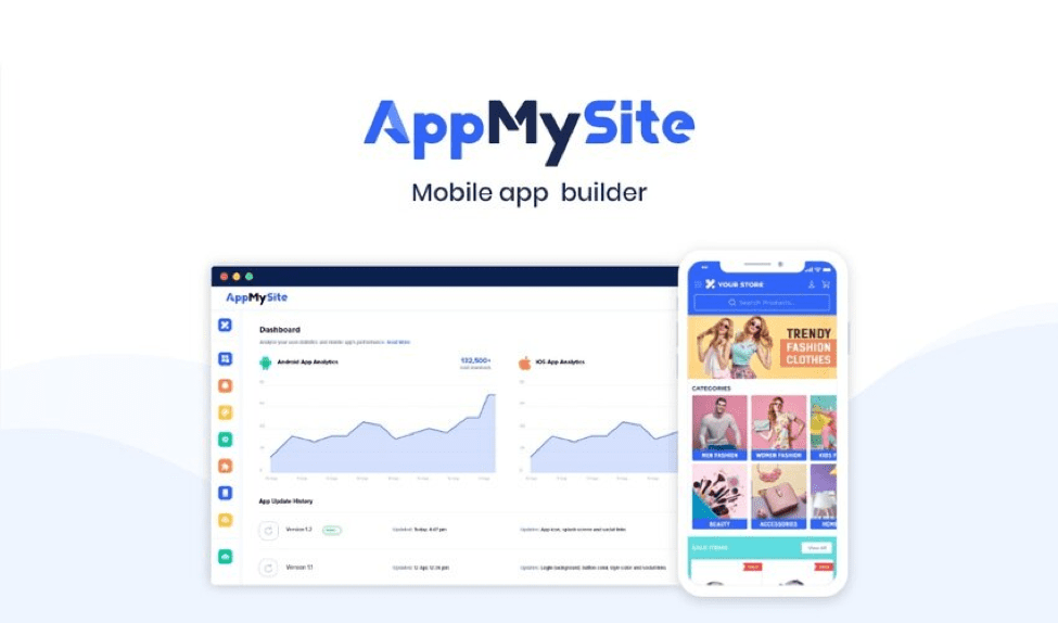
Owing to the emergence of DIY app makers like AppMySite, it has also become easier and more affordable to create high-quality native WooCommerce and WordPress mobile apps. Eventually, apps have become more viable and accessible.
However, a perfect app is the outcome of multiple things put together. One such important aspect of a mobile app is its design and layout.
In order to ensure a great app design and layout, one must strike the perfect balance between text and graphics. So, stay tuned with us and know all about it.
Suggested Read: The complete guide to UX terminology – All the design jargon professionals should know
Know why the art of balance is important in app design
Designing an app from scratch is nothing short of an art. When we say mobile app design, it constitutes all the primary elements that contribute to the app aesthetics. This includes text, image, graphics, buttons, alignment, color choices, white spaces, and a lot more.
However, out of all these elements, text and graphics are broadly the two most important ones. It is important to balance the ratio of text and image when it comes to designing the contents of the mobile app.
An app with too much text and less visuals can become dull and boring and increase the cognitive load on users. On the contrary, an app with only visuals and negligible amount of text, can become difficult to comprehend.
Thus, striking a balance between text and graphics is important to:
- Make the app intuitive and self-explanatory
- Reduce the cognitive load on your app users
- Boost the aesthetic appeal of the app
- Convey the goals of the app effortlessly
- Help app users reach their app usage goals
Suggested Read: Mobile App Typography: How to enhance your UI with text optimization
How to strike the perfect balance of graphics and text

Let us now cut to the chase and tell you how you can ace your app design with the perfect text and graphics. Go through the tips and strategies listed below and know it all!
a. Understand the visual grammar
In order to ace the design part, you must have an understanding of the visual grammar. Although, this is an extensive subject, you can still chisel your aesthetic sense and put it to use. For instance, the understanding of color, symmetry, visual weight of elements, etc., can help enhance your app design.
Apart from this, the understanding of the five basic principles of app design can also help you a great deal. These five principles are as discussed below in brief:
- Scale: This factor determines the importance and rank of the app contents based on their relative sizes and other similar elements. The scale of the content can be established using shape, size, order of appearance and other factors. For instance, bigger the size of the content, the more prominent the message. Ideally, texts should be smaller than graphics, but this can be altered as per the goal.
- Visual hierarchy: How you use the combination of text and images to guide the users on the screen and ultimately throughout the app, determines the visual hierarchy of the app. It is important that your app content has a hierarchy and remains standard throughout the app real estate.
- Symmetry: A pleasing and appealing arrangement of the text and contents on the app is as important as defining their symmetry. Although, the regularity can be broken and asymmetrical designs can be used in special cases, the harmony between text and graphics should be maintained.
- Contrast: Contrast is as important as symmetry. It helps all your elements to stand out without necessarily competing against each other. A noticeable difference based on size, shape, color, placement, etc., will help your users focus on both, text, and images.
- Coherence: The art of making everything stand out is as important as combining everything to paint a bigger and unified picture. This is something similar to the Gestalt Principle of design that lays emphasis on proximity, closure, symmetry, order, etc., where these things together unify all the contents that are otherwise separate in nature.
b. Identify the goals of your design
Even if you are not a design expert, you can still achieve your goals if you are aware of them. You can win half the battle by knowing the purpose of it. This will help you determine the best text to graphic ratio for your app, as all goals are different.
For instance, you may try the following things based on your requirements:
- Analyze your potential app users and design accordingly
- Avoid using too many words if you do not really need them
- Use images for things that can be described visually
Also, keep your existing brand theme and website design in mind. This will create uniformity and harmony between your website and app.
c. Create a storyboard or mind map
Create a storyboard or blue print of your app design. Having a mind map or a draft of the type of design that you want to achieve, can make your process easier.
You can also look out for other industry examples and checkout what is trending among the app users of your niche. Take professional help and implement what works best for you.
d. Break the process into segments
Breaking your app into segments can help you design it better. Remember, not all your app screens are the same. Hence, the distribution of text and images will also not be consistent throughout the app. Usually, images are given more preference on the initial screens.
For instance, the splash or launch screen is all about captive graphics. The on-boarding screens should have both, little bit of text and creative graphics as well. Whereas the home screen should strike a balance with an inviting banner and an intuitive menu.
e. Test, enhance and repeat
Testing, collecting feedback and improving as per the feedback is an important methodology to attain perfection in app development and design. You must follow the same course to get the perfect app.
The best approach is to create an app with a DIY app maker like AppMySite that allows you to design the app and monitor the progress of every step on the emulator in real-time. It also allows you to preview and test the app before you submit it on the app stores, thereby making the journey flawless and perfect.
Suggested Read: How does AppMySite simplify app design?
Need a simpler solution? Try AppMySite!
Sounds overwhelming? Do not worry! You are not the only one who has been intimidated with the nuanced complexities of mobile app design and UI. It can confuse even the experts and professionals.
So, what is the solution? The best and the most appropriate and effortless solution is to create an app with AppMySite. It is absolutely code-free, affordable, and easy to use.
It makes your job of app designing easier because it has the ensemble of the best app design and layout options to choose from. The templates have been set up by experts and each app that you create on AppMySite, can be a marvel in terms of design, layout, functionality as well as features. You can pick up images and illustrations from a free gallery or design everything from scratch.
You can easily balance the text and graphics as most of the information can be auto-populated and mirrored from your website. Sounds cool? There is more to it!
So, subscribe to AppMySite now to explore and test it yourself for free. Create your own aesthetic and appealing app for your customers and be ready for the mobile-friendly future.