Apple as a company has always wowed the world. It manufactures a lot of things like personal computers, smartphones, wearables, accessories, etc. However, it relies heavily on its iPhones when it comes to their roaring financial success.
Unlike Android, the iOS ecosystem appears a bit enclosed and esoteric to developers and consumers alike. Despite that, iPhones have a huge mass appeal and are quite popular across the globe.
When it comes to mobile app designing, development, and marketing for iPhones, one must adhere to the specifications and guidelines that are unique to Apple and its products. Today, we are here to help you cover one aspect of it.
We have compiled a screen size and resolution guide for iPhones of various generations. Having this information will help you make better design, development, and marketing decisions. So, let’s begin!
In this blog
- iPhone screen resolutions and sizes: An easy guide
- Some related terms that you should be aware of
- Why is understanding phone screen size & resolution so important?
- How to make your app look good on all iPhone screens?
- How to create an iOS app on a budget?
- App Store Screenshot requirements for iOS submission
- Frequently asked questions
iPhone screen resolutions and sizes: An easy guide
The evolution of iPhone screen sizes is not a mystery. Just like Android smartphones, iPhones come in various screen sizes and the size of display screens has grown bigger over the years.
As evident, mobile phone users have the “large screen, small device” paradox. We want elaborate displays on compact and portable devices and this choice has affected the screen design trends.
iPhone’s evolution seems to be adhering to a similar tendency. Let us go through an iPhone screen size comparison and understand better.
Evolution of screen sizes in iPhones
Based on screen size, iPhones can be grouped into the segments listed in the table below. We have also mentioned the year of release of the devices to help you get a grasp of the timeline. Here it goes:
| iPhone size comparison: Types of iPhones based on screen size | ||
| Screen size in inches (diagonal) | iPhone Model | Year of Release |
| 6.9 | iPhone 16 Pro Max* | 2024 |
6.7 | iPhone 16 Plus* | 2024 |
| iPhone 15 Plus | 2023 | |
| iPhone 15 Pro Max | 2023 | |
| iPhone 14 Plus | 2022 | |
| iPhone 14 Pro Max | 2022 | |
| iPhone 13 Pro Max | 2021 | |
| iPhone 12 Pro Max | 2020 | |
| 6.5 | iPhone XS Max | 2018 |
| iPhone 11 Pro Max | 2019 | |
| 6.3 | iPhone 16 Pro* | 2024 |
6.1 | iPhone 16* | 2024 |
| iPhone 15 Pro | 2023 | |
| iPhone 15 | 2023 | |
| iPhone 14 Pro | 2022 | |
| iPhone 14 | 2022 | |
| iPhone 13 Pro | 2021 | |
| iPhone 13 | 2021 | |
| iPhone 12 Pro | 2020 | |
| iPhone 12 | 2020 | |
| iPhone 11 | 2019 | |
| iPhone XR | 2018 | |
| 5.85 | iPhone 11 Pro | 2019 |
| iPhone XS | 2018 | |
| iPhone X | 2017 | |
| 5.5 | iPhone 8 Plus | 2017 |
| iPhone 7 Plus | 2016 | |
| iPhone 6S Plus | 2015 | |
| iPhone 6 Plus | 2014 | |
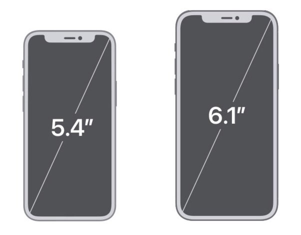
| 5.4 | iPhone 13 Mini | 2021 |
| iPhone 12 Mini | 2020 | |
| 4.7 | iPhone SE {3rd gen} | 2022 |
| iPhone SE {2nd gen} | 2020 | |
| iPhone 8 | 2017 | |
| iPhone 7 | 2016 | |
| iPhone 6S | 2015 | |
| iPhone 6 | 2014 | |
| 4 | iPhone SE {1st gen} | 2016 |
| iPhone 5S | 2013 | |
| iPhone 5C | 2013 | |
| iPhone 5 | 2012 | |
| 3.5 | iPhone 4S | 2011 |
| iPhone 4 (CDMA) | 2011 | |
| iPhone 4 (GSM) | 2010 | |
| iPhone 3GS | 2009 | |
| iPhone 3G | 2008 | |
| iPhone | 2007 | |
Just by going through the list above, you can determine the screen size of your target audience. If you are going for users with the latest iPhone models, you must design for bigger screens and higher resolutions (discussed below).
You can also go through the table on Apple Wiki and get the specifics for iPads if your audience includes people with tablets.
Classification of iPhones based on resolution
Apart from screen size, iPhones can also be classified based on their physical resolution. This includes the group of prevalent devices listed in the table below. We have added the resolution in pixels and in points. Additionally, we have also included the PPI (Pixels Per Inch) specification for the devices.
Here are the display specifications of different iPhone models:
| Display properties of different types of iPhones | |||
| iPhone Model | Resolution in pixels (Width x Height) | Resolution in points (Width x Height) | PPI |
| iPhone 15 Pro Max | 1290 x 2796 | 430 x 932 | 460 |
| iPhone 15 Plus | |||
| iPhone 14 Pro Max | |||
| iPhone 14 Plus | 1284 x 2778 | 428 x 926 | 458 |
| iPhone 13 Pro Max | |||
| iPhone 12 Pro Max | |||
| iPhone 11 Pro Max | 1242 x 2688 | 414 x 896 | |
| iPhone XS Max | |||
| iPhone 15 Pro | 1179 x 2556 | 393 x 852 | 460 |
| iPhone 15 | |||
| iPhone 14 Pro | |||
| iPhone 14 | 1170 x 2532 | 390 x 844 | |
| iPhone 13 | |||
| iPhone 13 Pro | |||
| iPhone 12 | |||
| iPhone 12 Pro | |||
| iPhone 11 Pro | 1125 x 2436 | 375 x 812 | 458 |
| iPhone XS | |||
| iPhone X | |||
| iPhone 13 mini | 1080 x 2340 | 375 x 812 | 476 |
| iPhone 12 mini | |||
| iPhone 8 Plus | 1080 x 1920 | 414 x 736 | 401 |
| iPhone 7 Plus | |||
| iPhone 6S Plus | |||
| iPhone 6 Plus | |||
| iPhone 11 | 828 x 1792 | 414 x 896 | 326 |
| iPhone XR | |||
| iPhone SE {3rd gen} | 750 x 1334 | 375 x 667 | |
| iPhone SE {2nd gen} | |||
| iPhone 8 | |||
| iPhone 7 | |||
| iPhone 6S | |||
| iPhone 6 | |||
| iPhone SE {1st gen} | 640 x 1136 | 320 x 568 | |
| iPhone 5C | |||
| iPhone 5S | |||
| iPhone 5 | |||
| iPhone 4S | 640 x 960 | 320 x 480 | |
| iPhone 4 | |||
| iPhone 3GS | 320 x 480 | 163 | |
| iPhone 3G | |||
| iPhone | |||
(The above details are represented in portrait mode. For landscape, you can just reverse the two numbers. Example: 1290 x 2796 becomes 2796 x 1290.)
As evident, the iPhone has also had devices with screen resolutions as low as 320 x 480 pixels, which was standard at one point in time. However, devices corresponding to such specifications are now no longer prevalent or in use.
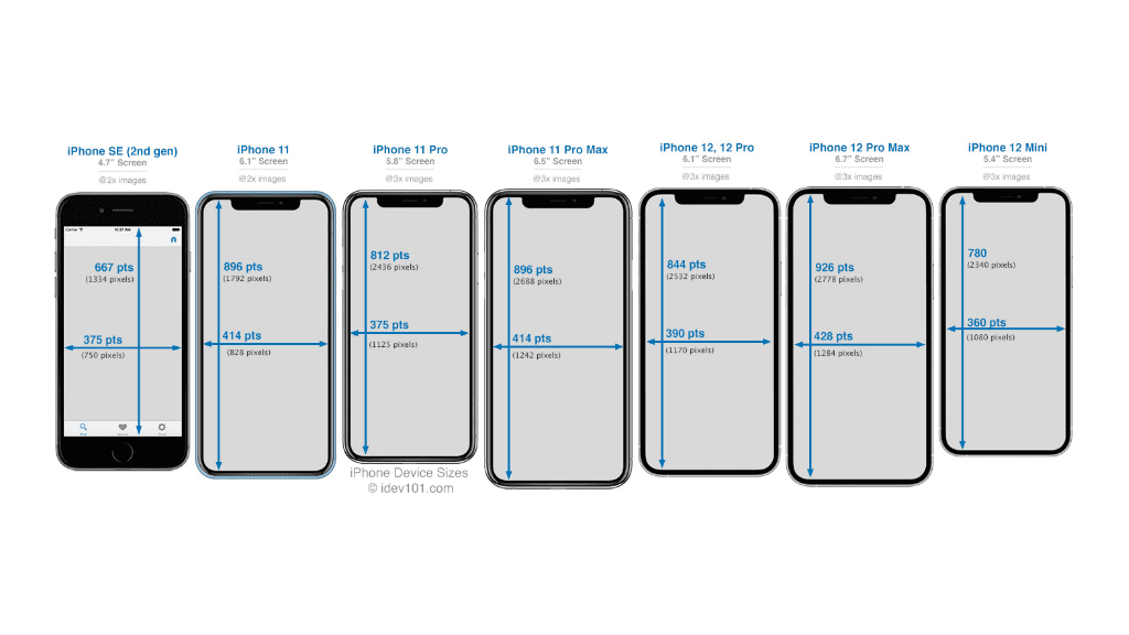
Image Source: iPhone Development 101
Some related terms that you should be aware of
To learn about iPhone screen sizes, resolutions, etc., it is also important to know about the terms that determine these specifications. Knowing about the terms related to iPhone screen size and design can help you understand this guide better.
Some important iPhone design terms that you should be aware of are as follows:
Screen Size
Screen size or display size is the physical measurement of the screen usually denoted in inches. Screen size measurements for smartphones are taken by measuring diagonally from the upper left-hand corner of the screen to the lower right-hand corner. However, the size of a screen can also be expressed in terms of the length and width of the screen.
Pixel (px)
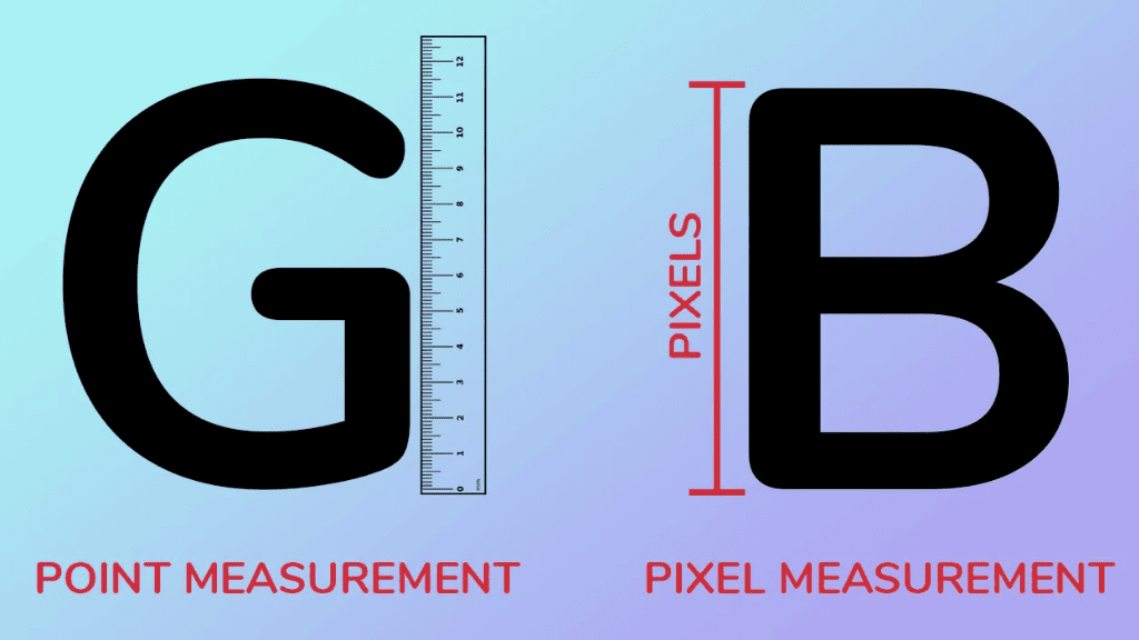
Pixel is a portmanteau of the two words “picture” and “element”. It is the smallest visible color unit on a display screen or the smallest unit of a digital image or graphic that can be represented on a device. These colored pixels are composed of associated red, green, and blue subpixels.
In fact, all digital images are actually made up of a large number of individual pixels. When we say that an element (Example: Font) is 12 px or 12 pixels in height, it means that the element takes up 12 pixels on the screen from top to bottom. The same goes for width.
Therefore, the next time you spot a specification that reads AxB pixels (where A and B are numerical values), remember that it signifies the height and width of the pixels. Note that pixels are combined to form a complete image, video, text, or any visible element on a device’s display.
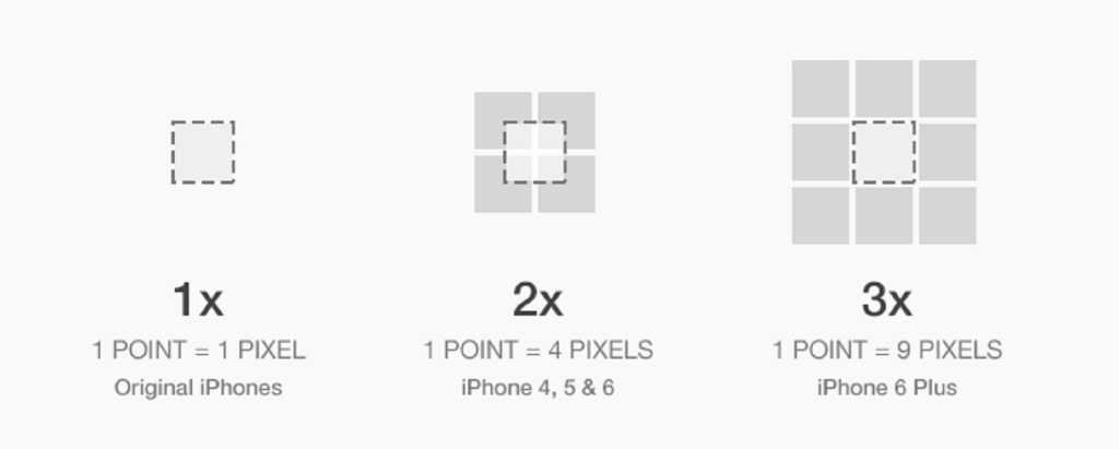
Point (pt)
Units like millimeters and inches are suitable for measuring physical items but not in the digital space. Thus, we use points as a size measurement unit. In fact, point was created as a unit of size/distance that enables graphics to be scaled independently of the resolutions of the device they are running on.
In simple terms, one point (pt) is equal to 0.352778 millimeters, 0.0138889 inches, or 1.333 pixels. On the other hand, one pixel is equal to 0.75 points. However, you must note that one point is almost equivalent to one pixel on a standard-resolution screen, while one point is equal to two or more pixels on high-resolution screens.
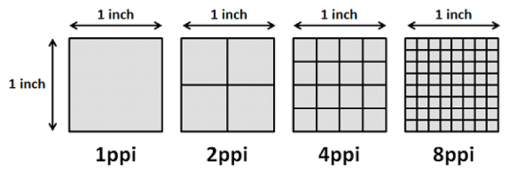
Pixels Per Inch (PPI)
PPI is the number of pixels (or dots in the case of DPI which is used in print) that can be placed in a line across one linear inch. In simpler terms, it refers to the number of pixels contained within each inch of a digital image. It can also be defined as the number of pixels a screen can display.
A screen with a high number of PPI will show more detailed visuals and the image will be less pixelated or distorted. This means that lower resolution images will contain larger sized pixels in fewer numbers. This will create the granular effect which we commonly call as ‘pixelated’.
On the other hand, high resolution images will contain smaller sized pixels in greater numbers. Thus, the quality of the images gets enhanced, ensuring more depth and clarity.
Resolution
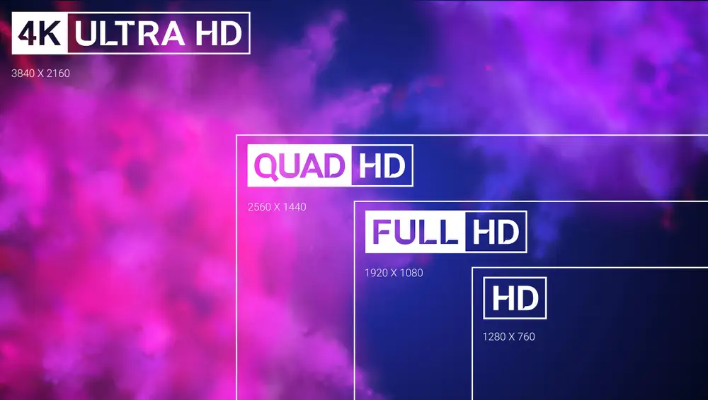
The display resolution is the number of distinct pixels in each dimension that can be displayed on the screen. In simple terms, it is a measure that describes the sharpness and clarity of an image. The better the resolution, the more detailed the image will be.
The standard display resolution sizes include:
| Different types of screen display resolutions | |
| Type | Resolution (in pixels) |
| High Definition (HD) | 1280 x 720 |
| Full HD (FHD) | 1920 x 1080 |
| 2K or Quad HD (QHD) | 2560 x 1440 |
| 4K or Ultra HD (UHD) | 3840 x 2160 |
(Note: The physical size of the screen has nothing to do with its resolution. Phones with smaller screens can also have a sharp picture quality and i.e., a high resolution.)
Why is understanding phone screen size & resolution so important?
Ever uploaded an image on social media that looked fine on Facebook but got partly hidden on the Twitter feed and cropped on Instagram? Have you ever landed on a blog or video that had truncated text or image?
If you have answered either of the questions with a “Yes”, then you must already know about the importance of perfectly sized and customized media, text, screen designs, etc.
When developing mobile apps or content for smartphones, understanding phone screen sizes and resolution becomes even more important. Let us understand the reason behind it and learn where this knowledge can come in handy.
Importance in app design and development
Understanding screen sizes, resolution, etc., is absolutely important for app design and development.
It can help you in the design and development process in the following ways:
- Stay aligned with design and development specifications.
- Remain in adherence to the app submission guidelines.
- Define your UI and UX goals and ensure design consistency.
- Give the right visual weight and balance to the design elements.
- Enrich and ease user experiences with the right design decisions.
- Adapt to different device types, screen types, operating systems, etc.
Importance in marketing and advertising
Understanding the nuances of phone screens is not just important for developers. It is also critical for marketers who want to serve impressive, inspiring, and user-friendly content to their audiences.
It can help marketers and advertisers in the mobile phone industry achieve the following:
- Segment audience based on technographic details (device type, screen type, etc.).
- Design the right app store screenshots and preview videos.
- Create adaptable and customized banners, creatives, videos, etc.
- Select the right design schematics, typography, etc., for ad creatives.
- Determine the suitable word and content density for different screens.
- Ensure content viewability and make it more interactive.
Statistics show that the size of the screen can determine cart abandonments and users are likely to abandon more carts on devices with smaller screens. Clearly, understanding phone screen sizes and resolution is important for all the reasons listed above and more than that.
It becomes especially important for iOS devices and iPhones as they are universal in their appeal and unlike Android, do not have a scattered and heterogeneous market. This also makes it easier to understand the screen specifications on iPhones in a coherent manner.
How to make your app look good on all iPhone screens?
The answer is simple: Follow Apple’s guides.
Apple recommends creating universal designs and using Xcode for creating a storyboard before launching an app. It has full-fledged guides on creating app designs that adapt across devices and screens.
However, if you want an easy and effective way out, you can also create the app with no-code DIY app creators that come with pre-defined environments. Here, you can create apps for all kinds of iOS users.
As a bonus, some may also enable you to test your apps’ designs and features for different iOS device types before you pay to publish. Well, AppMySite does that. You can read more about it here!
How to create an iOS app on a budget?
Have the specifications listed above left you confused? Well, let us uncomplicate things for you. What if we told you that you can create an iOS app from scratch in a completely guided environment and adhere to all the size and resolution guidelines by Apple?
Take our words as gospel! You can sign up for AppMySite and create a mobile app with our DIY mobile app builder without coding.
That’s not it! You can build dynamic, native, and feature-rich iOS apps, design, and customize all your screens and app elements, add features like push notifications and monetization, and do so much more.
Additionally, you can also push your apps on the App Store with AppMySite’s unique and automated ‘Publish App’ feature. Sign up for AppMySite now and create the best iOS app for your business within minutes.
App Store Screenshot requirements for iOS submission
Once the app is developed and built, the next step is to submit it to the app stores. For submitting an iOS app, you will need to add some screenshots from within the app. The Apple App Store has specified exact screenshot sizes for its different devices.
Here are the mandatory specifications and requirements for submitting app screenshots for the iOS app:
| iOS App Screenshot Size Requirement for iPhones | |||||
| Device size in inches (diagonal) | iPhone Model | Screenshot Size: Portrait (in pixels) | Screenshot Size: Landscape (in pixels) | Requirement | Screenshot source & Alternative |
| 6.7 | iPhone 15 Pro Max | 1290 x 2796 | 2796 x 1290 | Required if app runs on iPhone and 6.5-inch screenshots aren’t provided | Upload 6.7-inch screenshots |
| iPhone 15 Plus | |||||
| iPhone 14 Pro Max | |||||
| 6.5 | iPhone 14 Plus | 1284 x 2778 1242 x 2688 | 2778 x 1284 2688 x 1242 | Required if app runs on iPhone and 6.7-inch screenshots aren’t provided | Default: Scaled 6.7-inch screenshots Alternative: Upload 6.5-inch screenshots |
| iPhone 13 Pro Max | |||||
| iPhone 12 Pro Max | |||||
| iPhone 11 Pro Max | |||||
| iPhone 11 | |||||
| iPhone XS Max | |||||
| iPhone XR | |||||
| 6.1 | iPhone 15 Pro | 1179 x 2556 | 2556 x 1179 | Required if app runs on iPhone and 6.5-inch or 6.7-inch screenshots aren’t provided | Default: Scaled 6.5-inch or 6.7-inch screenshots Scaled 6.5-inch when 6.5-inch and 6.7-inch screenshots are both uploaded Alternative: Upload 6.1-inch screenshots |
| iPhone 15 | |||||
| iPhone 14 Pro | |||||
| 5.8 | iPhone 14 | 1170 x 2532 1125 x 2436 1080 x 2340 | 2532 x 1170 2436 x 1125 2340 x 1080 | Required if app runs on iPhone and 6.5-inch or 6.7-inch screenshots aren’t provided | Default: Scaled 6.5-inch or 6.7-inch screenshots Scaled6.5-inch when 6.5-inch and 6.7-inch screenshots are both uploaded Alternative: Upload 5.8-inch screenshots |
| iPhone 13 Pro | |||||
| iPhone 13 | |||||
| iPhone 13 mini | |||||
| iPhone 12 Pro | |||||
| iPhone 12 | |||||
| iPhone 12 mini | |||||
| iPhone 11 Pro | |||||
| iPhone XS | |||||
| iPhone X | |||||
| 5.5 | iPhone 8 Plus | 1242 x 2208 | 2208 x 1242 | Required if app runs on iPhone | Upload 5.5-inch screenshots |
| iPhone 7 Plus | |||||
| iPhone 6s Plus | |||||
| 4.7 | iPhone SE (3rd gen) | 750 x 1334 | 1334 x 750 | Required if app runs on iPhone and 5.5-inch screenshots aren’t provided | Default: Scaled 5.5-inch screenshots Alternative: Upload 4.7-inch screenshots |
| iPhone SE (2nd gen) | |||||
| iPhone 8 | |||||
| iPhone 7 | |||||
| iPhone 6s | |||||
| iPhone 6 | |||||
| 4 | iPhone SE (1st gen) | 640 x 1096 (without status bar) 640 x 1136 (with status bar) | 1136 x 600 (without status bar) 1136 x 640 (with status bar) | Required if app runs on iPhone and 5.5 or 4.7-inch screenshots aren’t provided | Default: Scaled 5.5 or 4.7-inch screenshots Alternative: Upload 4-inch screenshots |
| 3.5 | iPhone 4s | 640 x 920 (without status bar) 640 x 960 (with status bar) | 960 x 600 (without status bar) 960 x 640 (with status bar) | Required if app runs on iPhone and 5.5-inch iPhone screenshots aren’t provided | Default: Scaled 5.5-, 4.7-, or 4-inch screenshots Alternative: Upload 3.5-inch screenshots |
Here, you need to note that 6.5 inches and 5.5 inches are the most important display sizes for iPhones and Apple wants you to prioritize them. If you do not want to go through the pain of submitting screenshots for all the sizes listed above, then just create for these two screen sizes based on the specifications above.
Apple will automatically resize your screenshot as long as you have the screenshots for 6.5 and 5.5 inches. This is a standard practice followed by most developers.
Additionally, you must remember that while you must upload a minimum of 4 screenshots, the maximum limit is 10 screenshots for each app listing. You can go through our blog suggested below and know more about it.
Suggested Read: How to design the App Store Screenshots of your mobile app
Frequently asked questions
What is screen size and resolution?
In general, the size of a screen is equal to the length of the diagonal which can be described as the distance between its opposite corners. Usually, inch(es) is used as the metric to denote the size of screens across various types of devices like televisions, smartphones, etc. This is what is also known as the physical image size. On the other hand, the logical image size denotes a screen’s display resolution and is measured in pixels. Screen resolution can be defined as the number of distinct pixels in each dimension that can be displayed.
What is the screen size of the latest iPhones?
Here are the anticipated specifications of the latest iPhones that are due for launch:
- Screen size of iPhone 16: 6.1 inches
- Screen size of iPhone 16 Plus: 6.7 inches
- Screen size of iPhone 16 Pro: 6.3 inches
- Screen size of iPhone 16 Pro Max: 6.9 inches
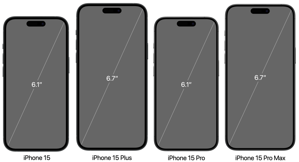
- Screen size of iPhone 15: 6.1 inches
- Screen size of iPhone 15 Plus: 6.7 inches
- Screen size of iPhone 15 Pro: 6.1 inches
- Screen size of iPhone 15 Pro Max: 6.7 inches
Why is mobile screen size measured diagonally?
It is believed that the method of measuring screen size by its diagonal was inspired by the method used for the first generation of CRT television. The picture tubes used in the tv had circular faces. Hence, the external diameter of the bulb was used to describe their size. One of the biggest reasons why sellers use diagonal measurements to denote phone sizes in the modern world is that the number ends up being bigger as compared to the length and width of the screen. As bigger numbers sound more lucrative to customers, it helps marketing efforts. Additionally, using just one number for the diagonal measurement is easier than using two numbers to denote the length and width.
Why is knowing screen size and resolution important for app design?
Screens are one of the most important aspects of any hardware and software ecosystem. It is the screen where all the information is displayed by the device and entered by the user. Moreover, there are various types of devices with a range of screen sizes, resolutions, and other specifications. In order to ensure that your content adapts to the screen specifications of your users, you must be aware of the size, resolution, and other factors. While creating device-agnostic designs is important, having an understanding of various types of devices is as essential.
How to create App Store Screenshots for iOS apps?
App Store screenshots help in giving a sneak peek into the app’s core design and features. In general, the screenshots should be appealing and captivating and express your brand’s identity and goals. While you can custom design screenshots for each screen size, it is not a very feasible idea. Therefore, you can design for the following sizes that are both default and mandatory:
- 6.5-inch iPhone screenshots with corresponding portrait and landscape sizes
- 5.5-inch iPhone screenshots with related portrait and landscape sizes
- 12.9-inch iPad screenshots for 2nd and 3rd generation with related portrait and landscape sizes
What is iOS application development?
iOS app development refers to the process of developing applications for Apple’s devices that mainly includes iPhones and iPads. Custom iOS apps are developed using programming languages like Swift or Objective-C. However, several no-code iPhone app makers like AppMySite also enable customers to create iOS apps without any coding. You can try the same if you are planning to create iOS apps.
How can I design iPhone apps?
While some aspects of app design remain the same across operating systems (iOS, Android, etc.), one should not compromise with a given platform’s unique guidelines and demands. As Apple is stringent and particular about the quality of its apps, it becomes imperative to design high-quality native-like apps that look and perform well. You can start with creating wireframes and mockups and then go on to create prototypes for your iOS app. Once you have the framework, you can transform the outline into a full-fledged iOS app design. Here’s one of our detailed blogs that can help you with the same. Mobile app design – The Complete Guide to Designing a Mobile app