Our previous blog on ‘The complete guide to iPhone screen resolutions and sizes’ has received an overwhelming response. As it continues to garner your attention and appreciation, we have decided to complement it with a parallel blog piece on Android screen sizes and resolutions.
If you are new to this space, you can give that blog a quick glance as it covers elaborate details and information related to screen sizes and resolutions. You will find definitions and terminology related to mobile screen size & resolution and other related information that will help you understand the topic better.
Else, you can skip that and continue to read. Do not worry. This blog has ample information that will help you understand the concept of different Android screen sizes and resolutions and how you can design and curate content for the same. Let’s get started!
In this blog
- The importance of screen size and resolution
- Guide to popular Android screen sizes and resolutions
- How to support different screen sizes for Android?
- Google Play Store requirements for Android app submission
- How to design and create an Android app easily?
- Frequently asked questions
The importance of screen size and resolution
Understanding screen size and resolution is important for anyone who has anything to do with display screens. If you are planning on developing or launching Android apps for your business or using it as a communication and marketing tool, then it becomes even more important for you.
Moreover, the knowledge of screen size and resolution can help you with the following:
- Understand and implement design specifications and principles
- Enhance user experience with aesthetic and eye-pleasing content
- Offer more visual clarity in your app’s design and content elements
- Ensure high-quality UI/UX, performance, quality, and scalability
- Make your app’s content and design elements look good on all screens
As evident, aligning your app with the size and resolution requirements can enhance its overall performance and feel. This eventually leads to better user engagement, conversions, and enhancement of other metrics, making your app more successful.
Guide to popular Android screen sizes and resolutions
Unlike Apple’s iOS which is restricted to iPhones, the Android OS universe is very fragmented and heterogeneous. There are several players in the market that create hardware and software for Android, and this leads to a vast diversification.
As there is a sundry collection of devices and their upgraded versions when it comes to Android, it is impossible to list the screen size and resolution specifications for each one of them. However, we will still try to give you a broad idea of the size and resolution trends across popular Android devices.
Screen Size
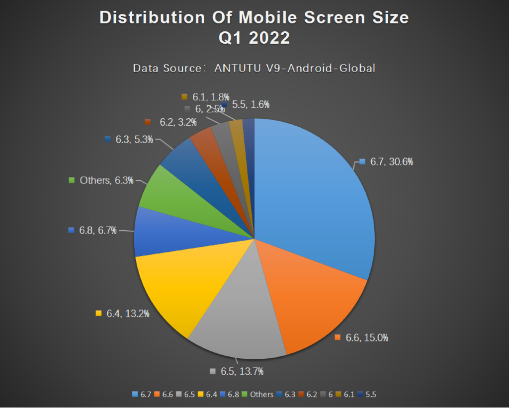
An increase in screen sizes has been dominant throughout the evolution of Android smartphones. Larger screens are now in trend and the numbers indicate the same. 6.7 inches is the latest hit among Android users. Here’s a glimpse of the market distribution:
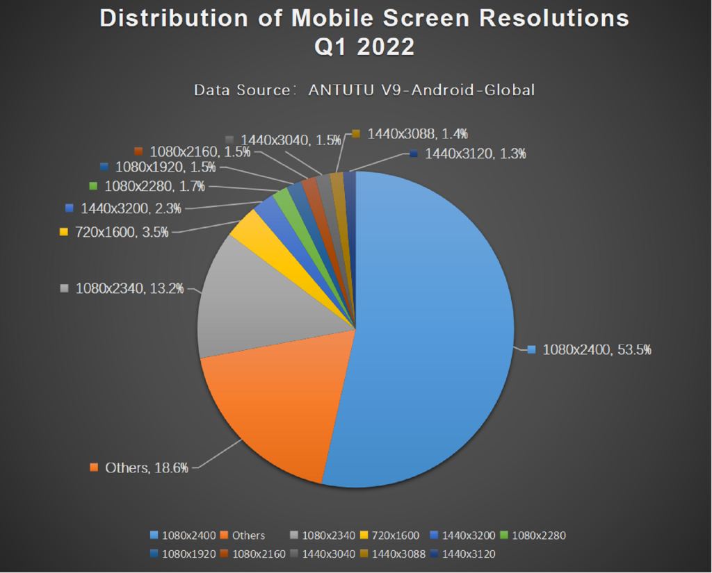
Screen Resolution
1080 pixels is considered the most mainstream resolution, and this stands true for Android as well. With slight variations due to phone screen sizes, this remains the common denominator across popular Android device resolutions. Here is the division of the Android market based on resolution:
When designing for Android, keep these specifications in mind and give priority to the popular segments. However, it is best to create adaptive and responsive designs that suit varied devices and screen types.
How to support different screen sizes for Android?
Whether you are planning to create basic blogging apps or take on full-fledged enterprise-level application development, design is going to be an integral part of the process. In fact, good design is a mandatory ingredient for your app’s success.
The key to building successful apps is to create responsive designs that look good on all kinds of Android devices of different sizes and specifications. The more devices you support, the wider your audience exposure will be.
Therefore, you must try to support different screen sizes and resolutions. Continue reading and learn more about making your app suitable for all kinds of Android devices.
Components of responsive Android app design
Here are the components that are primarily responsible for strategizing a responsive and adaptive Android app design:
Breakpoints:
A breakpoint in a responsive design is the “point” at which an app’s content and design will adapt in a certain way to ensure the best user experience.
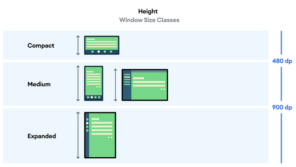
Window size classes:
Window size classes are a set of opinionated viewport breakpoints that enable designers and developers to create responsive and adaptive app layouts. Window size classes categorize the display area designated for the app as compact, medium, or expanded.
The classification is done separately for the width and height, creating distinct size classes for both. Available width is given more preference than height as vertical scrolling is more popular among users. This makes the size class more relevant to your app’s UI.
The representations of width and height-based window size classes are as follows:
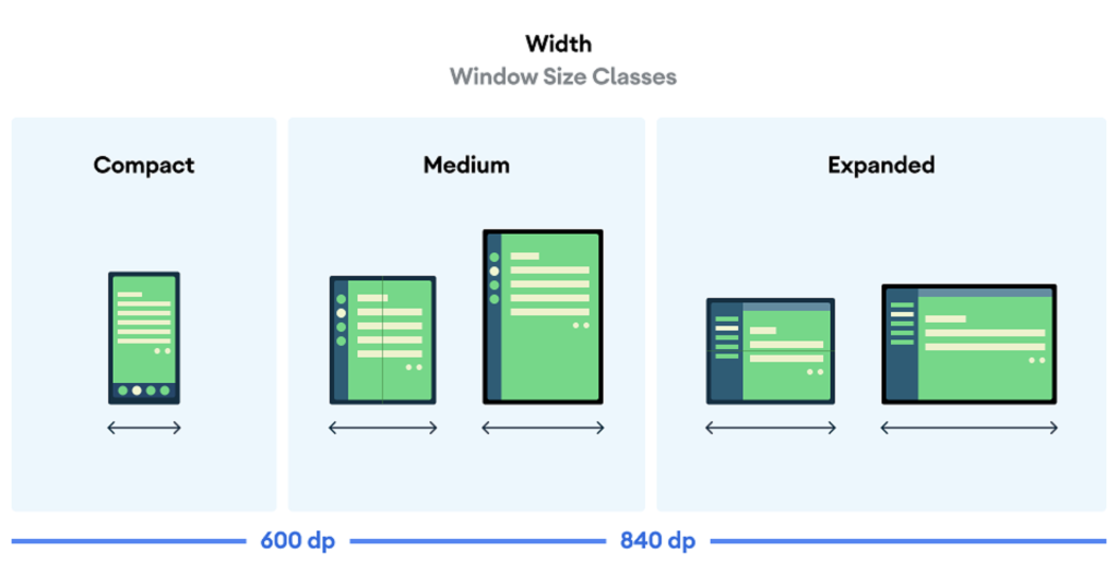
Note that although you can use size classes for visualization, window size classes are not determined by the size of the device screen. Instead, window size classes are determined by the space available to your app regardless of the device type.
To know more about using these components to create responsive Android app designs, you can go through the complete documentation by Android Studio: Support different screen sizes.
However, if you are new to this concept and need a code-free and simple solution to design responsive apps, then continue reading and find the same.
Google Play Store requirements for Android app submission
Statistics show that most apps are discovered by users through popular app marketplaces like Google Play Store and Apple App Store. Therefore, your responsibility does not end with designing the perfect app screens and content.
You will have to make your Android app stand out on the Google Play Store among millions of other apps. This can be done by making your Android app listing visually appealing and meaningful.
To submit your app to the Google Play Store, you will need a checklist of things. This will include the app’s preview assets (screenshots, videos, descriptions, etc.) that will portray a picture for your potential users by highlighting your app’s core vision, purpose, and features.
Apart from one preview video, you can use screenshots to tell your app’s story. As you submit screenshots to the Play Store, you will have to adhere to certain submission guidelines and size specifications.
Here are the mandatory requirements for submitting app screenshots to the Google Play Store:
- Minimum number of screenshots: 2
- Maximum number of screenshots: 8
- File Format: JPEG or 24-bit PNG (no alpha)
- Minimum dimension: 320 pixels
- Maximum dimension: 3840 pixels
- Maximum dimension must not be more than twice the minimum dimension.
These are the guidelines for the submission of screenshots. We recommend submitting at least 4 screenshots that have been taken from within the app. Use screenshots of at least 1080 pixels to ensure high-definition clarity and quality.
How to design and create an Android app easily?
Are you suffering from information overload? Have the above information and numbers left you confused and anxious? Do not worry! You can side-step all the information and number crunching and take the easy route to Android app design and development.
We understand that while having all the information helps, it is not possible for everyone to implement the learnings and create the perfect apps. In fact, the steps to conventional methods of app development are so complex that anyone can get confused and lost and give up mid-way.
You do not have to be one of them. Ditch the technically intensive and challenging methods of app development and create your app with AppMySite’s Android app builder. AppMySite has been created to simplify and fast-track app design and development and it can help you achieve the same.
Here, you can create apps that are dynamic and adaptive to all kinds of screens, sizes, resolutions, etc. The platform enables you to create native and responsive apps without any coding. From design to development and deployment, everything can be managed under one roof.
If it sounds too good to be true, you do not have to take our word. Just subscribe to AppMySite and start creating your app for free. Design, customize, add features, and preview your app for free and only pay to publish. Go live on the Google Play Store when you are ready and go mobile.
Suggested Read: The ultimate guide to mobile app development
Frequently asked questions
Why are screen size and resolution important?
Screens are an essential aspect of mobile device usage and experience. It is where all the action comes to life and all the information is displayed. Learning about screen size and resolution is important for those who are targeting audiences that are on the other side of the screen. To make your content appealing to users of all kinds of devices, you must have an understanding of different design aspects like size, resolution, pixels, etc. This can help developers, designers, and marketers to do their best and offer amazing content and experience to users.
What is Android screen resolution?
Resolution can be defined as the number of distinct pixels in each dimension that can be displayed on the screen. It is usually written in the form of width × height. For example, 1024 × 768 means the width is 1024 pixels and the height is 768 pixels. It denotes the sharpness and clarity of an image. The higher the resolution, the sharper the image will be. The standard display resolutions include HD (High Definition), FHD (Full HD), 2K or QHD (Quad HD), and so on. Different Android devices also follow the standard resolutions, and their display quality is determined accordingly.
How to measure mobile screen size for Android?
The screen size of smartphones is measured diagonally. It is generally measured from the upper left-hand corner of the screen to the lower right-hand corner. Other than that, screen size can also be expressed in terms of the length and breadth of the device. As Android has an elaborate ecosystem, there are several screen size options available out there.
How to create Play Store Screenshots for Android apps?
Screenshots created for app listings on Google Play Store fall under the “preview assets” category. This includes the feature graphic, screenshots, short description, and videos that are added to portray app information and highlights. The best way to create screenshots for Android app listings is to follow Google’s guidelines and use realistic screen images from within your app. Use artwork that has a professional look and feel and underline the outstanding features of the app. There are eight slots that you can use to tell your story. Use size and resolution as specified (refer to the blog above) and create screenshots and videos accordingly.
How can I design Android apps?
Some aspects of app design remain the same across platforms. However, there are several facets of app design and development that are exclusive to its targeted operating system and marketplace. If you have access to a professional team of designers and developers, you can use traditional app development frameworks and tools to design and develop your app. Else, you can go with the new age democratic approach and create your app with a DIY and code-free Android app creator like AppMySite. Such platforms enable you to design your apps like a professional. Build, test, and deploy your app on Google Play Store, the biggest marketplace for Android apps, and you will be good to go.